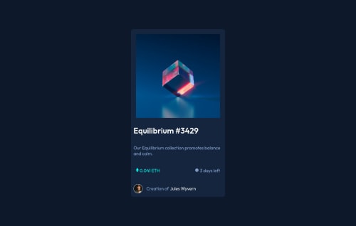
NFT Preview Card Component

Solution retrospective
I loved this challenge. Polished my css skills.
Please log in to post a comment
Log in with GitHubCommunity feedback
- @elaineleung
Hi Michelle, well done completing this, and happy to hear that you loved the challenge 🙂
I think you did a lot of things well here, such as being able to center the component. There are a few suggestions I have that can help you even in future projects:
-
Right now in your CSS, there aren't any reset/normalize rules. You'd always want to add these to every project because every browser has its own default styles, and my browser may be different from yours. There should at least be these few rules in every project, and here are some that I use, taken from Andy Bell's CSS reset:
// put these at the top of your sheet *, *::before, *::after { box-sizing: border-box; } * { font: inherit; margin: 0; padding: 0; } img, picture, video, canvas, svg { display: block; max-width: 100%; } html, body { height: 100%; } -
Instead of using a
width: 40vhon your card, try something likemax-width: 400pxinstead. The reason for that is, if I shrink the browser down, the height of the browser will affect the width, even if I don't change the browser width. Try doing that and see how it affects your card. -
I would remove the margins and padding you have on the image and just increase the padding on your card container instead (probably 1.5rem in desktop view and 1rem in mobile). This will make the padding look more even for the text area and the image; this might only work after you've added in the reset rules because there might be default padding and margin on the elements already, so be sure to add those rules in first before trying this.
Great work, and keep going! 😊
Marked as helpful -

Join our Discord community
Join thousands of Frontend Mentor community members taking the challenges, sharing resources, helping each other, and chatting about all things front-end!
Join our Discord