Skip to content
  • Unlock Pro
  • Log in with GitHub
Solution
Submitted over 2 years ago

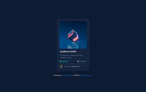
Responsive NFT card using CSS with his unique capabilities for styling

SlavenaDuhneva•80
@SlavenaDuhneva
A solution to the NFT preview card component challenge
View live sitePreview (opens in new tab)View codeCode (opens in new tab)

Solution retrospective


Hello everyone ,this was my 3th project here !Thank you so much ,FrontEnd Mentors !It's worth every second to practise the things ,which you have learned and turn them into something real .

I am not very familiar how the project could be responsive for mobile and desktop devices . If I need to improve something in my code to turn the project into a fully responsive mode , I would be very grateful to receive an advice .

Thank you !

Code
Select a file

Please log in to post a comment

Log in with GitHub

Community feedback

  • Joshua Dail•290
    @joshdail
    Posted over 2 years ago

    Nice job!

    From what I can tell, your project is fine as far as appearing correctly on desktop and mobile. One good thing is that you are using rem for font sizes and not pixels. That can be important also for accessibility. Also, I see you are using CSS custom properties which are very helpful for responsive design.

    As far as responsive design for desktop/tablet/mobile, I generally will use media queries for different screen sizes. So I might have @media (width < some_width) for mobile, then another for tablet size, and so on. I will use Chrome or Firefox Devtools to see where the app starts to break or look incorrect at a certain width, and use that as a basis for where to switch from desktop to tablet or mobile.

    Using Flexbox and Grid for your page layouts is also great for responsiveness, since for Flexbox you can change rows to columns as the screen shrinks, and with Grid you can change the rows and columns as needed to fit different sizes.

    Kevin Powell has a great Youtube channel and also a free course on responsive design on his website https://www.kevinpowell.co, you may find that helpful

    Marked as helpful
  • SlavenaDuhneva•80
    @SlavenaDuhneva
    Posted over 2 years ago

    Thank you so much for your great advices about the responsive mode and the benefits of the Grid and Flexbox mode . I already checked the Kevin Powell's videos in Youtube last night and the information, which he provides us is so valuable, especially for those of us who just started learning CSS !!!

    Best wishes!

Join our Discord community

Join thousands of Frontend Mentor community members taking the challenges, sharing resources, helping each other, and chatting about all things front-end!

Join our Discord
Frontend Mentor logo

Stay up to datewith new challenges, featured solutions, selected articles, and our latest news

Frontend Mentor

  • Unlock Pro
  • Contact us
  • FAQs
  • Become a partner

Explore

  • Learning paths
  • Challenges
  • Solutions
  • Articles

Community

  • Discord
  • Guidelines

For companies

  • Hire developers
  • Train developers
© Frontend Mentor 2019 - 2025
  • Terms
  • Cookie Policy
  • Privacy Policy
  • License

Oops! 😬

You need to be logged in before you can do that.

Log in with GitHub

Oops! 😬

You need to be logged in before you can do that.

Log in with GitHub

How does the accessibility report work?

When a solution is submitted, we use axe-core to run an automated audit of your code.

This picks out common accessibility issues like not using semantic HTML and not having proper heading hierarchies, among others.

This automated audit is fairly surface level, so we encourage to you review the project and code in more detail with accessibility best practices in mind.

How does the CSS report work?

When a solution is submitted, we use stylelint to run an automated check on the CSS code.

We've added some of our own linting rules based on recommended best practices. These rules are prefixed with frontend-mentor/ which you'll see at the top of each issue in the report.

The report will audit all CSS, SCSS and Less files in your repository.

How does the HTML validation report work?

When a solution is submitted, we use html-validate to run an automated check on the HTML code.

The report picks out common HTML issues such as not using headings within section elements and incorrect nesting of elements, among others.

Note that the report can pick up “invalid” attributes, which some frameworks automatically add to the HTML. These attributes are crucial for how the frameworks function, although they’re technically not valid HTML. As such, some projects can show up with many HTML validation errors, which are benign and are a necessary part of the framework.

How does the JavaScript validation report work?

When a solution is submitted, we use eslint to run an automated check on the JavaScript code.

The report picks out common JavaScript issues such as not using semicolons and using var instead of let or const, among others.

The report will audit all JS and JSX files in your repository. We currently do not support Typescript or other frontend frameworks.

Oops! 😬

You need to be logged in before you can do that.

Log in with GitHub

Oops! 😬

You need to be logged in before you can do that.

Log in with GitHub