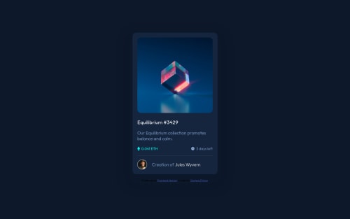
@najeeb-anwari
Posted
Hello Finney, I hope you are doing great. I hope this is helpful for you. Your design is nice but here is what I think you should do to make it better.
- Add your main content to main tag and add the attribution to the footer to make it more semantic. You can simply use main tag instead of div with wrapper class.
- Avoid using section here because that requires heading. Try to make it simple.
- No need for using
margin: 0 auto;
in.wrapper
selector because flexbox is already making it center. - Your card is cut off in mobile landscape view. To fix that use min-height instead instead of height for your wrapper selector.
- No need for query media here just use
max-width: 350px
for the .card selector. - On smaller screen there is no gap between the screen edges and the content. You can add some margin to wrapper selector or add some padding to the body.
To make the hover effect on the image you can do as follow.
- In your html file do the following:
<div class="img-container">
<img class="image" src="images/image-equilibrium.jpg" alt="image-equilibrium">
<div class="overlay"><img src="./images/icon-view.svg" alt="View"></div>
</div>
- In your CSS file add the following styles the following:
.img-container {
position: relative;
display: flex;
cursor: pointer;
}
.overlay {
display: flex;
justify-content: center;
align-items: center;
position: absolute;
background-color: hsla(178, 100%, 50%, .5);
border-radius: 15px;
width: 100%;
height: 100%;
opacity: 0;
transition: .4s;
}
.img-container:hover .overlay {
opacity: 1;
}
- I don't want to explain the above code just look at and try to understand what is going on.
- If you want to know how I did it, here is my project https://www.frontendmentor.io/solutions/nft-preview-card-component-using-flexbox-HJD8mOq89
Marked as helpful
@Finney06
Posted
@najeeb-anwari thanks a lot for the help finally got every thing corrected and its works perfectly but still trying to understand how it worked because have been having issues in understanding positioning quite well.But thanks anyways for the feedback.
@Finney06
Posted
@najeeb-anwari still confused about what the role of "display:flex" on ".img-container" don't mind if my question looks dumb am still newbie😪
@najeeb-anwari
Posted
@Finney06 Hey Finney your question is not dumb. It is really good habit. The image height was a little lower then the img-container height so I used flex because by default it stretches the content of the container. Set the height of img-container to 500px to see what is going on. Anyway that is not the only way. You could actually use some other methods for example setting the background-image of the img-container and setting a height for that since it doesn't have any content. But that doesn't work perfectly though you could use background-image as cover which can cut of the image . You can also set the image width and height to 100% and then use object-fit property as cover. object-fit works in similar way as setting background image's position to cover. You can research for object-fit property on google to find out more about it.