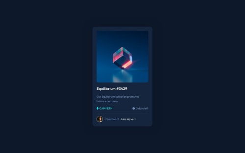
NFT Preview Card Component | HTML & CSS

Solution retrospective
While working on this project, I made a big mistake by starting from the mobile view (thanks to an extension called Perfect Pixel) :D And it was a great lesson for me :) So, my codes became very messy. Do you have any advice for me to clean up these codes?
What did you find difficult while building the project?
I struggled a bit with the hover effect on the image, but other than that, it was easy.
Which areas of your code are you unsure of?
MY CODE IS SO MESSY! :D
Please log in to post a comment
Log in with GitHubCommunity feedback
- @Shiiron
Hello there !
First of all congratulation on finish your project !
I think your code became messy because you don't have a hold on how to implement desktop or mobile design first.
A growing number of applications and websites do work with 'Mobile first' as we say. This means that we start to work at a lower scale (mobile scale) and change things as resolution goes up.
So in your code you are using media queries to target specific width in order to change style depending on the device resolution. But with the approach mobile first, the main styling should not be in media queries, but in plain css => That means that changes will only occurs when device resolution goes up. Therefore you should be changing the details inside a media query.
I will try to give you an example from your code but feel free to tell me if you don't understand the principle : inside both your media queries you have this class (line 156) :
.container{
    position: relative;
    display: grid;
    max-width: 22em;
    background-color: var(--clr-card-bg);
    padding: 1.5em;
    border-radius: 1em;
    gap: .45em;
    box-shadow: 0 0 3em .01em var(--clr-box-shadow);
}
and below (line 262) :
  .container{
    position: relative;
    display: grid;
    max-width: 20.5em;
    background-color: var(--clr-card-bg);
    padding: 1.5em;
    border-radius: 1em;
    gap: .45em;
    box-shadow: 0 0 3em .01em var(--clr-box-shadow);
}
We can see a bunch of attributes that are duplicated since they both apply to the class container (such as position and display). but we can see that the max width will change depanding on the query
What we want to do is to say "okay, my design suggest that my box will be in position relative and display grid"
so instead of doing multiple queries, you can simply say :
.container {
  position: relative;
  display: grid;
  max-width: 20.5em;
}

@media (min-width:20.5em){
  .container {
    max-width: 22em;
  }
}
This means that starting from 20.5em width, your container will have his max-width changed but without changing all the other attributes.
I also have a few advices for you :
- Be careful with indenting code => This makes your code harder to read and understand
- When talking about design, if you decide to go mobile first you usually work with min-width since you want css to change starting a certains width and up. If you work desktop first, it's the other way around, you use max-width since you want to work from a certain width and below.
Feel free to ask me again if you didn't understand what i said. Hope this help you in the futur !
Keep up the great work !
Marked as helpful - P@danielmrz-dev
Hello @ArdaBozan!
Your solution looks great!
- About your question:
While working on this project, I made a big mistake by starting from the mobile view (thanks to an extension called Perfect Pixel) :D And it was a great lesson for me :) So, my codes became very messy. Do you have any advice for me to clean up these codes?
Well, in my opinion, starting by mobile view is never a mistake, considering that mobile first approach tends to make our work easier, not harder.
Do you mind telling me what happened during the process that made you feel that it was a mistake thanks to the Perfect Pixel extension ?
I always use this extension at the end of my projects to compare the final results as I don't have access to the figma files either, so I'm a bit curious. I honestly don't know what the mobile first approach has to do with the extension... 🤔
Marked as helpful - @Alokray007
Hello there 👋
Good job on completing the challenge !
Your project looks really good!
I have a suggestion about your code that might interest you.
There is an very useful browser extension called Perfect Pixel that allow you compare with the design image and thus see the exact dimensions. I recommend it to you.
📌 Tags like <div> and <span> are typical examples of non-semantic HTML elements. They serve only as content holders but give no indication as to what type of content they contain or what role that content plays on the page. This tag change does not impact your project visually and makes your HTML code more semantic, improving SEO optimization as well as the accessibility of your project.
I hope this suggestion is useful for future projects.
Other than that, great job!
Happy coding.
Marked as helpful


Join our Discord community
Join thousands of Frontend Mentor community members taking the challenges, sharing resources, helping each other, and chatting about all things front-end!
Join our Discord