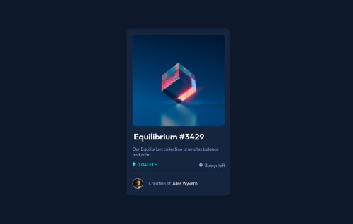
NFT preview card component solution

Solution retrospective
This is my first ever project, and I can tell that I made a decent amount of mistakes. How do I get the image to display the icon with the background changed at the same time?
I also had a lot of trouble getting some parts of the card inline with each other. Is there a better way to go at it then the way I implemented?
I started my web development journey a week and a half ago, and would love some feedback on how to avoid redundancy in my code, make it easier, and some alternative ways I could've gone at it.
Please log in to post a comment
Log in with GitHubCommunity feedback
- @phichayut-pak
Hi! I would say it's a great start for you! But first of all, congratulations on your project! 🎉🎉 Here are the things I would suggest :
-
For your question, I fixed it by playing with opacity on hover. You might wanna try that out, or another way is to use
groupandgroup-hoverfrom TailwindCSS ( it's a css framework that pretty much makes our styling quicker and easier ) -
You might be using padding without noticing that the overflow on x axis appears. Take a deep look on this, it'll affect a lot when you're working with different designs.
-
Font size and Font weight matter! You can choose whether you want to fix on this one, it's just for more detail.
Keep studying and practicing! 🔥🔥
Marked as helpful -
- @gcapistrano
Hi, @thejackshelton! Great start! I'm also a beginner, but I'd like to suggest a way to display challenges that I had used. I displayed challenges sorting by easier first and filtering, in my case, by checking free, newbie, and HTML & CSS options. There are ten of them by now. I intend to go through each one, easiest to hardest. Maybe you had already made this procedure, but it could be useful anyway. Keep coding!
Marked as helpful


Join our Discord community
Join thousands of Frontend Mentor community members taking the challenges, sharing resources, helping each other, and chatting about all things front-end!
Join our Discord