


PhoenixDev22• 16,990
@PhoenixDev22
Posted
Hi Phoenix243,
Congratulation on finishing this challenge. Great job on this one! I have few suggestions regarding your solution:
HTML
- You can use the
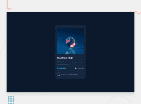
<main>landmark to wrap the NFT. And<footer>landmark to wrap the attribution, using landmarks is important to improve navigation experience on your site for users of assistive technology
- The most important part in this challenge interactive elements. Since there's a :hover state on the image and means it's interactive, So there should be an interactive element around it. When you create a component that could be interacted with a user , always remember to include interactive elements like(button, textarea,input, ..)
for this imagine what would happen when you click on the image, there are two possible ways:
1: If clicking the image would show a popup where the user can see the full NFT, here you use
<button>. 2:If clicking the image would navigate the user to another page to see the NFT, here you can use<a>.
For the same reason, you can use <a> to wrap Equilibrium #3429 .
- Page should contain a level-one heading. For future use , use the headers in a chronological order. How you order headings dictates how a screen reader will navigate through them. As you go down a level, the number should increase by one, like a numbered list within an outline. In this challenge , as it’s not a whole page, you can have
<h1>visually hidden withsr-onlyclass and use<h2>instead of<h3>
- The link wrapping the equilibrium image should either have
Sr-onlytext, anaria-labeloralttext that says where that link takes you.
- For any decorative svgs, each svg tag should have
aria-hidden="true"andfocusable=”false”attributes to make all web assistive technologies such as screen reader ignore those svgs in(icon-view, icon-ethereum, icon-clock ).
- Profile images like that avatar are valuable content. The alternate text of the avatar’s image should not be profil. You can use the creator's name
Jules Wyvern. Read more how to write an alt text
- For middle part of the card
class="card-flex", you can use an unordered list<ul>, in each<li>there should be<svg>and<p>instead of<h5>. That way you can align them centrally.
- There are so many ways to do the hover effect on the image, The one I would use is pseudo elements
::before, ::after. You can use pseudo-elements to change the teal background color to hsla. Then the opacity can be changed from 0 to 1 on the pseudo element on the hover. Also using pseudo elements makes your HTML more cleaner as there's no need for extra clutter in the HTML
Hopefully this feedback helps.
Marked as helpful
0
Phoenix243• 310
@PhoenixMputu
Posted
@PhoenixDev22 Thank you for your comment. I already apologize if my English is not correct because it's not my first. I am a basic French speaker. Your remarks were useful to me because these are things that I often neglect during the realization of the challenges of the platform.
1
