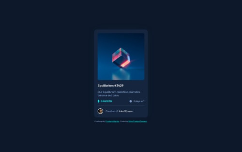
NFT preview card component using Pure CSS

Solution retrospective
Hello everybody,
I tried to implement the coloured hover effect for the image, like shown in the design specs, but I couldn't figure it out, if anyone has any idea on how to do it, please let me know.
Thank you.
Please log in to post a comment
Log in with GitHubCommunity feedback
- @KTrick01
Hi! The hover effect can be make easily with an ::after or ::before pseudoelement, here is a quick demo for you using your classes:
.card__img::after {
  content: "";
  position: absolute;
  background-color: #5bb02c70;
  inset: 0;
  transform: translateX(100%);
  transition: .3s;
}
.card__img:hover::after {
  transform: translateX(0);
}
.card__img {
overflow: hidden;
}
Try it! I hope that it helps you!
Marked as helpful - @PhoenixDev22
Hello Shiva,
Congratulation on completing this challenge. Excellent work! I have few suggestions regarding your solution, if you don't mind:
HTML
- The attribution should be wrapped by
<footer>, it should live outside the<main>.
- The most important part in this challengeinteractive elements. Since there's a :hover state on the image and means it's interactive, So there should be an interactive element around it. When you create a component that could be interacted with a user , always remember to include interactive elements like(button, textarea,input, ..)
for this imagine what would happen when you click on the image, there are two possible ways:
1: If clicking the image would show a popup where the user can see the full NFT, here you use<button>. 2:If clicking the image would navigate the user to another page to see the NFT, here you can use<a>.
For the same reason , you can use
<a>to wrapEquilibrium #3429.- The link wrapping the equilibrium image should either have
Sr-onlytext, anaria-labeloralttext that says where that link takes you.
- For any decorative images, each img tag should have empty
alt=""and addaria-hidden="true"attributes to make all web assistive technologies such as screen reader ignore those images in( icon-view, icon-ethereum, icon-clock ).
- Profile images like that avatar are valuable content. The alternate text of the avatar’s image should not be
Avatar, it’s meaningless. You can use the creator's nameJules Wyvern. Read more how to write an alt text
- If you wish to draw a horizontal line, you should do so using appropriate CSS. You may remove the
<div class=”line”>, you can useborder-top:to the avatar's part.
- Adding
rel="noopener"orrel="noreferrer"totarget="_blank"links. When you link to a page on another site usingtarget=”_blank”attribute , you can expose your site to performance and security issues.
- There is a little gap under the image, you should set it
display: block;
- Remember a css reset on every project. That will do things like set the images to display block and make all browsers display elements the same.
Aside these, Great job on this one. Hopefully this feedback helps.
Marked as helpful - The attribution should be wrapped by


Join our Discord community
Join thousands of Frontend Mentor community members taking the challenges, sharing resources, helping each other, and chatting about all things front-end!
Join our Discord