NFT Preview Card Component using SASS

Please log in to post a comment
Log in with GitHubCommunity feedback
- @YariMorcus
Congratulations on completing this challenge Kevin!
I have been taking a peek at your solution, and everything looks very well designed! There are, however, a couple of small things I do want to share with you.
These points are related to making your design look a little more like the mobile design given to you.
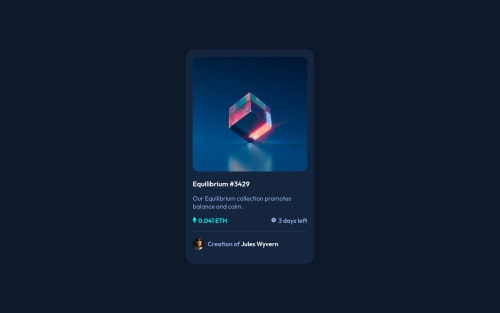
- The padding of your section with class .card should be a little larger. I have been trying to figure out the right value, and this should be approximately 2.5rem.
- The title (your
<h2>) should be a little bigger. You should increase the font size to 2.3rem. - The
font-weightCSS property in file _typography.scss on line 8, contains an invalid value. You used the value oflight, but I think you meantlighter. The CSS declaration is now invalid due to this mistake. - You should decrease the font size of the
.card__reviewclass from 1.8rem to 1.7rem. In combination withfont-weight: lighter, the text looks a little more according to the design. - The text in
<p>(0.041 ETH) should be a little smaller. I have been trying to figure out the right value, and this should be approximately a font size of 1.7rem The text in<p>(3 days left) and<p>with class .card__div--2__review should not have a font-weight of bold (if I am seeing this right in the design). If you changed the font size of prior point, you should also set the font size on both<p>elements to 1.7rem for consistency.
The following point is related to your hover state of the image:
- You should change your
opacity: 0.7toopacity: .5(.5 is the same as 0.5). This way, the cube in the image can be seen a little easier (such as seen in the design).
I also took a look at your CSS, but I am not seeing anything that you should pay attention to.
I hope you can do something with the feedback I gave you. If you have any more questions, feel free to ask me.
If I made a mistake somewhere in this post, feel free to correct me and keep building awesome things :D.
- @snowbot22
Thank you so much fot the feedback !

Join our Discord community
Join thousands of Frontend Mentor community members taking the challenges, sharing resources, helping each other, and chatting about all things front-end!
Join our Discord