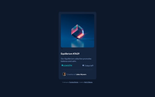
NFT Preview Card Component with HTML, CSS, and Flexbox

Solution retrospective
I still struggle to get flexbox to work correctly; or rather I struggle to write it correctly. I feel like I understand it well, but I'll spend hours looking for a reason it's not displaying as I intend. I think I need to practice A LOT more before flexbox becomes second nature. I really like it, and when I finally get things to work, I am so incredibly happy.
Question #1: Is anyone willing to give me some constructive criticism on my code? I am not one who asks questions, not because I don't want to, but because I don't know what to ask. I think I accomplished the task given, but did I do it well?
Question #2: Is it normal to spend lots of time (hours!!) tweaking the CSS to make things look just so ?
TYIA for any and all help; it is so greatly appreciated!!
Please log in to post a comment
Log in with GitHubCommunity feedback
- @elaineleung
Hi Marta Jo, first off, you've done a great job completing this challenge! Not only does the solution look very close to the design, you've also done many things well (such as using flexbox). I also appreciate the way you've asked for feedback, and so, here are some of the thoughts I have that address the points you listed and also might give you some ideas on how to tackle future projects:
-
Great job centering the component, which is one thing that many people actually struggle with. The one thing I'd change in the body selector is
height: 100vh, which I would write asmin-height: 100vhinstead. To understand why, try resizing the browser's height and make it so that the window height is smaller than the contents. You may find that part of the content is cut off; this is because the body only has a fixed height of100vh. When you usemin-height: 100vh, the body selector would make sure its height is at least greater than 100vh, and therefore all the contents get shown. -
In your desktop view, your card has a max-width of 350px, and if I resize the window width and make it smaller, the component would suddenly grow huge at your breakpoint, and then become small again. That jarring jump in size is not really something you'd want. If you want the component to be at 350px even past the 600px breakpoint, I'd have
max-width: 350pxput in the.cardselector already and not in the media query. It is OK to havewidth: 90%withmax-width: 350pxin the same selector; that's actually like writingwidth: min(90%, 350px). -
There's a bit of leftover code that got cut off somehow (not sure whether you can see the
">under the image), but yes, that happens at times! -
In your
smallflexcontainers, I see that you've wrapped the containers with another set of containers; you can actually just have one container. Here's how I'd write the HTML and CSS:HTML: <div class="smallflex1"> <div class="smallflex-item"> <img src="./images/icon-ethereum.svg" class="card-icon" alt="Ethereum"> <p class="price"> 0.041 ETH</p> </div> <div class="smallflex-item"> <img src="./images/icon-clock.svg" class="card-icon" alt="Clock"> <p class="time"> 3 days left</p> </div> </div> CSS: .smallflex-item { display: flex; align-items: center; // for vertical alignment } .smallflex-item img { margin-right: 0.5rem; // for the spacing between the icon and text } -
I think you need some more reset/normalize rules in your CSS; you have the
box-sizing: border-boxin the star selector, but right now there's still the default padding and margin in the browser. Without these rules, the padding and margins you set could be off, and for me, the first thing I do for any project is to copy and paste in my reset rules. Here are some basic ones to get you started:*, *::before, *::after { box-sizing: border-box; } * { margin: 0; padding: 0; font: inherit; } html, body { height: 100%; } img, picture, video, canvas, svg { display: block; max-width: 100%; }
As David says, it really is normal to spend lots of time trying to get something to look right, especially in the beginning when you're experimenting with what works and what doesn't. It's also normal to write out a whole bunch of CSS declarations, but you'll later discover that a lot of the code isn't necessary, and I learn a lot when I go back to my old solutions to clean up the code and learn from past mistakes. One thing that helps is, I like to comment out code and see whether something gets changed. If nothing is changed, chances are that line isn't necessary, and I'd keep it commented out instead of deleting it until the very end when I'm happy with all changes.
Hope some of this can help you out, and I really think you're doing a great job already, so keep experimenting and keep going! 😊
Marked as helpful -
- @correlucas
👾Hello Marta, congratulations for your new solution!
Here's some tips for you:
To make the card responsive you need to use
max-width: 340pxinstead ofwidth: 90%and a a better value for the border radius isborder-radius: 12px.card { background: hsl(216, 50%, 16%); display: flex; flex-direction: column; border-radius: 12px; font-size: 18px; max-width: 340px; padding: 20px; }Your pricing section starts to break after
320pxa better way to save space inside the container and make the pricing section become two rows is by adding a media query, here;s the code for that:@media (max-width: 340px) { .smallflex1 { display: flex; flex-direction: column; margin: 0 auto 25px; text-align: center; } }👋 I hope this helps you and happy coding!
Marked as helpful - @PhoenixDev22
Hello Marta Jo Telkamp,
Congratulation on completing this challenge. Excellent work! I see you have received some incredible feedback. I have few suggestions regarding your solution, if you don't mind:
HTML
- The most important part in this challengeinteractive elements. Since there's a :hover state on the image and means it's interactive, So there should be an interactive element around it. When you create a component that could be interacted with a user , always remember to include interactive elements like(button, textarea,input, ..)
for this imagine what would happen when you click on the image, there are two possible ways:
1: If clicking the image would show a popup where the user can see the full NFT, here you use<button>. 2:If clicking the image would navigate the user to another page to see the NFT, here you can use<a>.
For the same reason, use
<a>to wrapEquilibrium #3429 and Jules Wyvern.- Page should contain a level-one heading. In this challenge , as it’s not a whole page, you can have
<h1>to wrap theEquilibrium #3429
- The link wrapping the equilibrium image should either have
Sr-onlytext, anaria-labeloralttext that says where that link takes you.
- For any decorative images, each img tag should have empty
alt=""and addaria-hidden="true"attributes to make all web assistive technologies such as screen reader ignore those images in( icon-ethereum, icon-clock ).
- Profile images like that avatar are valuable content. The alternate text of the avatar’s image should not be
avatar, it’s meaningless. You can use the creator's nameJules Wyvern. Read more how to write an alt text
- Never use
<div>and<span>alone to wrap a meaningful content. Just keep in mind that you should usually use semantic HTML in place of the div tag unless none of them (the semantic tags) really match the content to group together. By adding semantic tags to your document, you provide additional information about the document, which aids in communication.
- For middle part of the card
class="smallflex1", you can use an unordered list<ul>, in each<li>there should be<img>and<p>for the reason stated before. That way you can align them centrally.
- Adding
rel="noopener"orrel="noreferrer"totarget="_blank"links. When you link to a page on another site using target=”_blank” attribute , you can expose your site to performance and security issues.
There are so many ways to do the hover effect on the image, The one I would use is pseudo elements
::before, ::after. You can use pseudo-elements to change the teal background color to hsla. Then the opacity can be changed from 0 to 1 on the pseudo element on the hover. Also using pseudo elements makes your HTML more cleaner as there's no need for extra clutter in the HTML.Overall, Your solution is good. Hopefully this feedback helps.
Marked as helpful - The most important part in this challengeinteractive elements. Since there's a :hover state on the image and means it's interactive, So there should be an interactive element around it. When you create a component that could be interacted with a user , always remember to include interactive elements like(button, textarea,input, ..)
for this imagine what would happen when you click on the image, there are two possible ways:
- @DavidMorgade
Hello Marta, congrats on finishing the challenge, you did a pretty good job, keep it going!
I would like to suggest you a little thing.
I saw that you are using margin on your
mainand in yourfooter, you don't need to since you are already using flexbox to center your items on the body, if you want to get a bit of separation between the footer and the main, you can usegapinstead of margin-top.For your question #2, it's normal that you waste a lot of time trying to get a solution, even more experience developers can take hours thinking of CSS solutions because they are not CSS experts, the experience will give you the improvements to make decision on your CSS faster and get your projects in no time!
Hope my feedback helps you!
Marked as helpful


Join our Discord community
Join thousands of Frontend Mentor community members taking the challenges, sharing resources, helping each other, and chatting about all things front-end!
Join our Discord