NFT Preview Card (Vanilla CSS + Custom Design and Hover Effects)

Solution retrospective
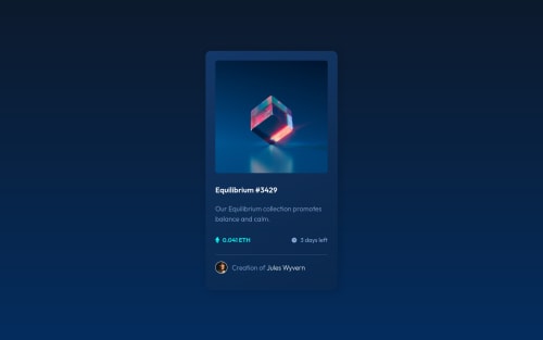
👾 Hello, Frontend Mentor coding community. This is my solution for the NFT Profile Card Component.
👻This the last of my old solution that I've cleaned the HTML code and CSS(even if is not the cleanest possible yet). Since now I'll submit only new challenges. I've changed a little bit the design and add some custom hover effect inside all elements card elements.
- 🎨 Custom Gradient Design
- 🥃 Color Spinning hover on text
- 🎨 Custom Icon Hover effect
Feel free to leave any feedback about my design chances and help me improve my solution or make the code clean!
Please log in to post a comment
Log in with GitHubCommunity feedback
- @PhoenixDev22
Hi Lucas,
Congratulation on finishing another Frontend mentor challenge.
Another great solution! I have some suggestions regarding your solution, if you don't mind:
- The most important part in this challenge is the interactive element. Since there's a :hover state on the image and means it's interactive, So there should be an interactive element around it. When you create a component that could be interacted with a user , always remember to include interactive elements like(button, textarea,input, ..) For this imagine what would happen when you click on the image, there are two possible ways:
1: If clicking the image would show a popup where the user can see the full NFT, here you use
<button>.2:If clicking the image would navigate the user to another page to see the NFT, here use
<a>.- You should have used
<a>to wrapEquilibrium #3429.
- The link wrapping the equilibrium image (
image-equilibrium) should either haveSr-onlytext, anaria-labelthat indicates where the link navigate the user(not describes the image).
- If you wish to draw a horizontal line, you should do so using appropriate CSS. Remove the
<span class="line"> </span>, you can useborder-top:to the avatar's part.
- To use more semantic tags , you may use
<figure>and<figcaption>for the avatar's part.
- For any decorative images, each img tag should have empty
alt=""and addaria-hidden="true"attributes to make all web assistive technologies such as screen reader ignore those images in (`icon-view).
- The alternate of the avatar image should not be avatar, it’s meaningless. You can use the creator's name
Jules Wyvern.
- There are so many ways to add the hover effect on the image , The one I would use, using pseudo-elements to change the teal bg color to a hsla. Then opacity can be changed from 0 to 1 on the pseudo element on hover. There is no need for a extra clutter in the HTML. The icon view doesn’t really need to be in the HTML. You can use CSS for it.
- Great work with animations, you have added some nice animations, so it's best to make sure that the animations are off for the users who requested to minimize the amount of non-essential motion it uses.. You can use the
prefers-reduced-motion queryto do that.
Aside these, Excellent work! Hopefully this feedback helps.
Marked as helpful - @vanzasetia
Hello, Lucas! 👋
Nice work on this challenge! 👍 The new design for this challenge looks good! 🙌 Also, there are a lot of cool animations for the card! 👏
But, two things could be improved.
- Firstly, I would recommend using the
prefers-reduced-motionmedia query to turn off the animations for people who prefer not to see them. Animation can be harmful to some people so you want to make sure that the users can control the animations. - Secondly, I suggest using the modern CSS reset from Piccalilli for your next project. It focuses on accessibility as well. For more information, I would recommend reading his article to learn more about his CSS reset.
I hope this helps! Keep up the good work! Happy coding! 😄
Marked as helpful - Firstly, I would recommend using the
- @Rajeshsingh127
I don't have feedback. I'm a beginner and your code is helping me a lot!
- @NationsAnarchy
Not sure if there's anything wrong, however, I couldn't view the source code on GitHub, Lucas :< I'd love to steal the code you did for the avatar since I couldn't really do it by myself xD. Otherwise - great job as always, thank you very much!
- @chukwudobe-Micah
Hey, please I wanna ask a question. How did you do the active stage for the image? Did you put the cyan colour over the image (I don't know if that's possible with CSS) or is the cyan colour the the background color of the view icon? Please I need a reply to help me with my own work.
- @loifloro
hi! i looked up for your codes and asking why you aren't using <figure> tag on your images?
- @Mrbabet
Lucas since when are you learning css and html?
- Account deleted
Congrats on another great looking project!
Adding on to what @PhoenixDev22 pointed out, to make your content fully accessible to all users, you want to implement rem/em going forward. I attached an article, which goes into more detail:
The entrance animation does take a little long before it appears into users screen, so I would recommend reducing the time on that.
Regarding the use of
<figure>and<figcaption>for the author/avatar section, generally those are use as a reference to a certain content; like when website post a picture and right underneath it, it has the source of it.A good example of
<figure>and<figcaption>usage is Bugatti's website: https://www.bugatti.com.If you look at their website and scroll down to their model/universe section you'll see how they implement it.
More info regarding
<figure>and<figcaption>: https://developer.mozilla.org/en-US/docs/Web/HTML/Element/figure


Join our Discord community
Join thousands of Frontend Mentor community members taking the challenges, sharing resources, helping each other, and chatting about all things front-end!
Join our Discord