Skip to content
  • Unlock Pro
  • Log in with GitHub
Solution
Submitted 8 months ago

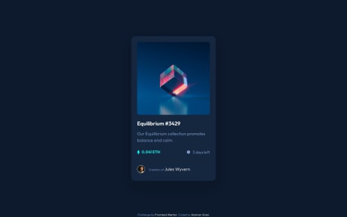
NFT Preview Card with Astro, Sass and CUBE CSS

accessibility, astro, cube-css, sass/scss
P
Kamran Kiani•2,780
@kaamiik
A solution to the NFT preview card component challenge
View live sitePreview (opens in new tab)View codeCode (opens in new tab)

Solution retrospective


What are you most proud of, and what would you do differently next time?

I began a new learning path on Frontend Mentor, and this was the first challenge I completed. I chose the CUBE CSS methodology for styling my HTML code.

I don't plan on repeating this challenge.

What challenges did you encounter, and how did you overcome them?

One of the challenges was deciding whether an interactive element should be an a or a button. I chose the button because it doesn't navigate to a new page but performs an action. For the hover style, I used ::before and ::after pseudo-elements to add a background color and an icon image to the clickable button.

What specific areas of your project would you like help with?

I’d appreciate feedback on the CSS code and methodology I’ve used, specifically if it's been applied correctly. Additionally, if you notice any issues with my HTML code or accessibility, please let me know. Your feedback is incredibly valuable to me.

Code
Select a file

Please log in to post a comment

Log in with GitHub

Community feedback

  • P
    Eli Silk•850
    @elisilk
    Posted 6 months ago

    Hi 👋 @kaamiik,

    Congrats on a very nice solution. 👏

    I really like how you tried to use the CUBE CSS methodology, as I also just completed this same challenge with the same goal. It was a little counterintuitive to me, but it looks like you were able to implement it well.

    If you are up for diving in 🤿 a little further, here are a couple things I noticed:

    • I think you can try combining the pseudo-elements for the hover overlay effect on the image into one ::before pseudo-element. That way you don't need to worry about z-index at all. You can also put the opacity directly onto the color using the relative value syntax of hsl(), which is one of my favorite features. This way the opacity applies only to the color, and is not also on the SVG image. In the end, the CSS would be something like this:
    .card__imgButton::before {
      border-radius: 8px;
      background-color: hsl(from var(--primary-400) h s l / 50.3%);
      background-image: url(/assets/images/icon-view.svg);
      background-repeat: no-repeat;
      background-position: center;
      opacity: 0;
    }
    
    .card__imgButton:is(:hover,:focus)::before {
      opacity: 1;
    }
    
    • I'd also suggest taking off the width and height from the .card__img class. The image will resize to fill it's container, so those aren't really needed. And when you keep them in there, the image can get distorted or not fill up the full width of the card as the browser window is resized.

    • Finally, I think the font sizes in your final .card__profile section could be cleaned up a bit. It looks like the link to the name is a font size that is too large, while the font size for the text "Creation of" is too small. In the design, all of the text in that section is one, consistent font size, and it actually goes from 15px in the mobile version to 16px in the desktop version. For simplicity, I'd suggest making them all one font size, and so using your .fs-400 class would work.

    Anyway, just some ideas to consider if you are thinking about improving on your solution. 🤔

    Great job overall! Happy coding. 💻

    Eli

Join our Discord community

Join thousands of Frontend Mentor community members taking the challenges, sharing resources, helping each other, and chatting about all things front-end!

Join our Discord
Frontend Mentor logo

Stay up to datewith new challenges, featured solutions, selected articles, and our latest news

Frontend Mentor

  • Unlock Pro
  • Contact us
  • FAQs
  • Become a partner

Explore

  • Learning paths
  • Challenges
  • Solutions
  • Articles

Community

  • Discord
  • Guidelines

For companies

  • Hire developers
  • Train developers
© Frontend Mentor 2019 - 2025
  • Terms
  • Cookie Policy
  • Privacy Policy
  • License

Oops! 😬

You need to be logged in before you can do that.

Log in with GitHub

Oops! 😬

You need to be logged in before you can do that.

Log in with GitHub

How does the accessibility report work?

When a solution is submitted, we use axe-core to run an automated audit of your code.

This picks out common accessibility issues like not using semantic HTML and not having proper heading hierarchies, among others.

This automated audit is fairly surface level, so we encourage to you review the project and code in more detail with accessibility best practices in mind.

How does the CSS report work?

When a solution is submitted, we use stylelint to run an automated check on the CSS code.

We've added some of our own linting rules based on recommended best practices. These rules are prefixed with frontend-mentor/ which you'll see at the top of each issue in the report.

The report will audit 1st-party linked stylesheets, and styles within <style> tags.

How does the HTML validation report work?

When a solution is submitted, we use html-validate to run an automated check on the HTML code.

The report picks out common HTML issues such as not using headings within section elements and incorrect nesting of elements, among others.

Note that the report can pick up “invalid” attributes, which some frameworks automatically add to the HTML. These attributes are crucial for how the frameworks function, although they’re technically not valid HTML. As such, some projects can show up with many HTML validation errors, which are benign and are a necessary part of the framework.

Oops! 😬

You need to be logged in before you can do that.

Log in with GitHub