


@grizhlieCodes
Posted
Super awesome for you to practice extra stuff with this project, that's the spirit I LOVE (i tend to maximise my learning per project also).
When it comes to color, I struggle also.
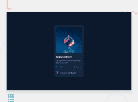
From what I can tell is that you can't simply 'reverse' colors and hope for the best. Sort of like the complete invert-standard that seems to be prevelant amongst newer designers/developers. You need to find a similar 'theme' color and build around it. It can also be said that for this project you might have kept this card identical, even though the background changed since it's a nice contrast.
Imagine you had 3 cards, this would be the center, and the cards on the left/right would be the ones with the white/light-gray background. All of a sudden you've made this stand out massively. I'm just saying it's not as simple as one may think.
Feel free to criticise my website's dark/light mode toggle and tell me what you think. I think we can discuss and learn from the criticism. I'll be honest, I spent 5% of my time implementing the light mode and coloring so it probably sucks. I just wanted it to seem bearable.
I also like discussing stuff :).
An interesting resource is material ui (I think this is basically a google built team that creates AMAZING resources and guidelines for us devs/designers). They cover their thinking/principles/fundementals in incredible and useful detail :)
Marked as helpful
