Not Found
Not Found
Not Found
Not Found
Not Found
Not Found
Not Found
Not Found
Not Found
Not Found
Not Found
Not Found
Not Found
Not Found
Not Found
Not Found
Not Found
Not Found
Not Found
Not Found

Submitted

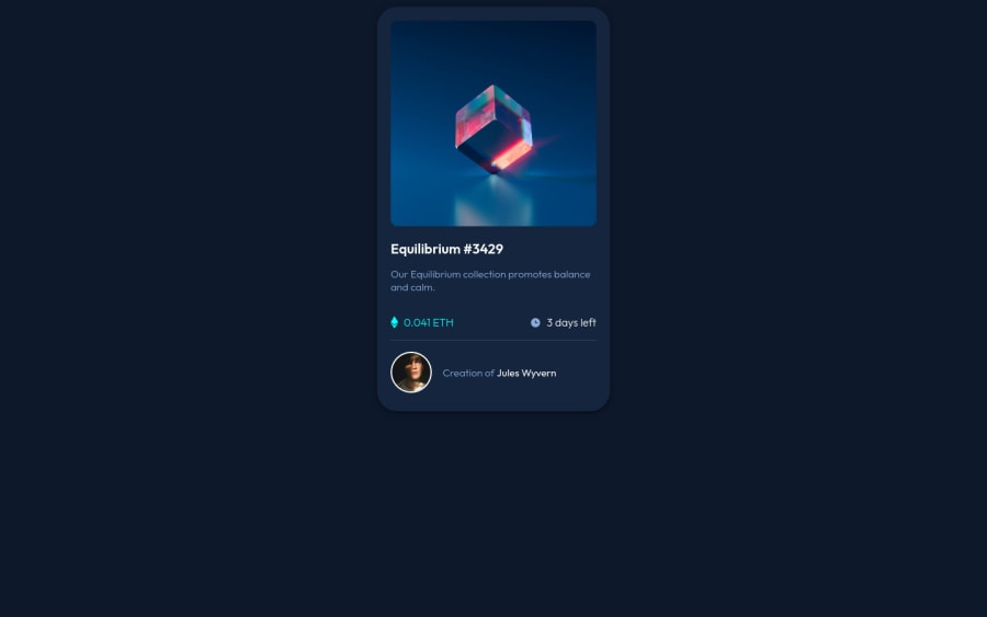
NFT Preview Card-Component

David Yuβ€’ 50

@boostbm

Desktop design screenshot for the NFT preview card component coding challenge

This is a solution for...

  • HTML
  • CSS
1newbie
View challenge

Design comparison


SolutionDesign

Solution retrospective


This took me a while and had to get a little help but any feed back would be great. Thanks.

Community feedback

Travolgi πŸ•β€’ 31,460

@denielden

Posted

Hi David, I took some time to look at your solution and you did a great job!

Also I have some tips for improving your code:

  • To make it look as close to the design as possible decrease border-radius from .container class at 1rem
  • remove all margin from container class because with flex they are superfluous
  • instead of using px try to use relative units of measurement -> read here

Overall you did well :)

Hope this help and happy coding!

Marked as helpful

1
Naveen Gumasteβ€’ 10,480

@NaveenGumaste

Posted

Hello David Yu ! Congo πŸ‘ on completing this challenge

Let's look at some of your issues, shall we:

  • Always use the "alt attribute" and write what img is , and if the img is for decorative then leave it empty but always add it with alt.

  • Warp your card content around the main tag Ex: πŸ‘‡

<body>
<main class="container">
*all you content here*
</main>
</body>
  • Card border-radius is more reduce it a bit

happy CodingπŸ˜€

Marked as helpful

1
codezelossβ€’ 570

@codezeloss

Posted

Great work David! Even report issues keep going, by practicing a lot everything will be fine in the future (;. Trick: If you want to center your solution in the design comparison, you can add: display:flex, justify-content: center, align-items: center; height: 100vh. to your code, more specifically to the main container class. Good luck!!!

Marked as helpful

1
LiBeeβ€’ 390

@Li-Bee

Posted

Looks very good 😁 - well done on the hover and icon animation on the picture took me ages to do that!

Few comments for your consideration - most are minor points.

  1. Try and center the card component. Add the following to <body> = height: 100vh

  2. Increase font-weight on 0.041 ETH

  3. The 'font-color' on 3 days left should be the same as the <p> text.

  4. Try and make the avatar picture a bit smaller, it is a bit big

  5. Maybe reduce the shadow color on box-shadow a little bit too dark looks like a line, perhaps change the alpha value to 0.3.

You also have a few accessibility and html issues to sort out. Broadly:

  1. For your <img>add alternative text which describes what the picture is (e.g. alt="picture of glass cube"). (This will also clear the html issues)

  2. Add <main></main> to you body which surround the card div. This will clear the landmark issue.

  3. Change the <h2> heading to <h1> that will clear the level-one heading issue. Need at least one <h1> on page.

Marked as helpful

1

David Yuβ€’ 50

@boostbm

Posted

@Li-Bee Thank you so much !! I will fix these once I get back home from work! Appreciate the help! Have a great day!

0

Please log in to post a comment

Log in with GitHub
Discord logo

Join our Discord community

Join thousands of Frontend Mentor community members taking the challenges, sharing resources, helping each other, and chatting about all things front-end!

Join our Discord