Not Found
Not Found
Not Found
Not Found
Not Found
Not Found
Not Found
Not Found
Not Found
Not Found
Not Found
Not Found
Not Found
Not Found
Not Found
Not Found
Not Found
Not Found
Not Found
Not Found

Submitted

NFT Preview Card(Not Ideal Solution But This Is To Show How Far I Got)

Larry 190

@ljcutts

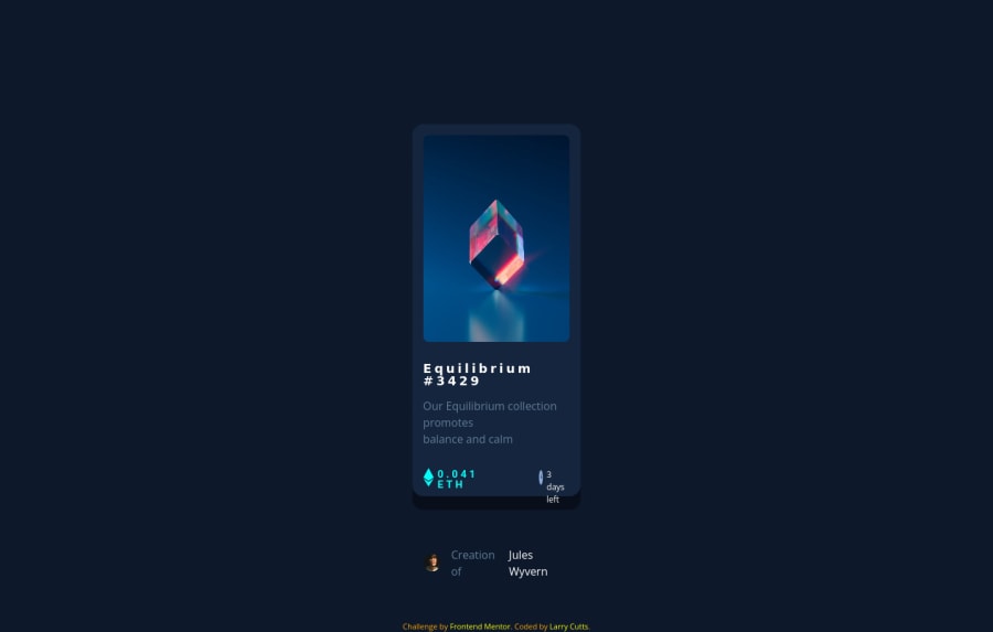
Desktop design screenshot for the NFT preview card component coding challenge

This is a solution for...

  • HTML
  • CSS
1newbie
View challenge

Design comparison


SolutionDesign

Solution retrospective


I don't understand why my CSS is falling apart when you collapse the website and shrink it's size. Please give out feedback for how I did and things I need to work on. This is my first project I did alone with just HTML and CSS. Still in the learning process of this.

Community feedback

@MojtabaMosavi

Posted

1- width: 17vw; height: 60vh; Only removing these propertis makes a huge difference in how the layout look and behaves.

2- <section> element is a general sectioning element but it shoudn't be used as container where a div can be used, which is the case for "price-and-time" and "person-and-image".

3- This is just a tips, whenever you come across something new that you don't know how to implement, the first thing you shoud do is spend some time grasping what you're building, you evetually develop you own method if you keep doing these challanges. The purpose of doing these challanges is not to just get them done as quickly you can but rather to focus on learning.

Keep coding :=)

Marked as helpful

0

Larry 190

@ljcutts

Posted

@MojtabaMosavi Thank you for the feedback! I think I'm still learning what specific html elements to use such as "section", "article" "main", "header".

0
Nam HaÏ 820

@Nam-Hai

Posted

Avoid giving % value to width or height. Here you used vw which is basicaly the same. Some time it has its use but when you can avoid it, avoid it. Give your container fix width. You can then use max-width and give a %.

On the time-price container. Flexbox might have been a better idea. You can use the justify-content: space-between to put the price container on one side and the time container on the other side. Do not use margin to do this on the time-container. This is a really bad habit; flexbox is a very powerfull tool now.

I advice you to train yourself on how Flexbox works because basically everything can be done with flexbox now.

Try this website to learn how to use flexbox : flexboxfroggy.com/#en

Marked as helpful

0

Larry 190

@ljcutts

Posted

@Nam-Hai Thank you very much for the feedback. A little upset about this issue(which is me being hard on myself) but this advice has given me some hope.

0

Please log in to post a comment

Log in with GitHub
Discord logo

Join our Discord community

Join thousands of Frontend Mentor community members taking the challenges, sharing resources, helping each other, and chatting about all things front-end!

Join our Discord