


Wendy• 1,670
@wendyhamel
Posted
Hi, Good job on completing this challenge.
Some improvement for the design:
- The header has a bolder font in the design than in your solution.
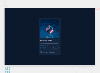
- The ethereum and clock image should be horizontally aligned to center.
- It is also better to only wrap text in a
<p>tag. U can use the<div>tag instead and keep the text in a<p>or<span>. - The box shadow is a bit to black. You can add your own color and adjust the alpha channel. For example: `rgba(0, 0, 0, 0.4) is black but opaque.
I don't see the active states from the design. Did you leave them out on purpose?
Happy Coding!
0

