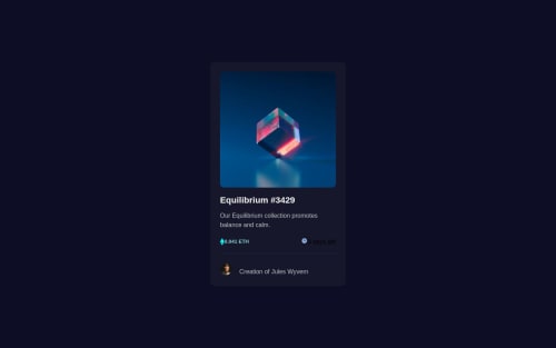
NFT Preview

Solution retrospective
Completed this NFT Preview challenge. I always seem to have issues with hovering and span functions. If anyone has any tips and resources of the thought process or good practice tips, I would like to be able to determine how to use these functions on my own.
Please log in to post a comment
Log in with GitHubCommunity feedback
- @imadvv
Greeting Diana Jordan! Congratulations for completing your challenge!, 👏👏👏.
they is a lot of ways to archive this overly effect, this is good resource from w3school, and also this blog post has some good information, but I did some changes to your code to make it function,
html
    <div class="images">
      <img src="images/image-equilibrium.jpg" alt="equilibrium" class="image-first">
    </div>
css
main .images{
    position: relative;
    background-color: rgb(139, 213, 218);
    border-radius: 10px;
    z-index: 1;
    overflow: hidden;
}

.image-first{
    max-width: 100%;
    transition: opacity 200ms ease-in-out;
}
.images::after{
  content: "";
  position: absolute;
  background-image: url("./images/icon-view.svg");
  background-position: center;
  background-repeat: no-repeat;
  width: 3rem;
  height: 3rem;
  top: 50%;
  left: 50%;
  transform: translate(-50%, -50%);
  z-index: 10;
  opacity: 0;
  visibility: hidden;
  transition: all 250ms ease-in-out;
}

.images:hover .image-first{
  opacity: .2;
}
.images:hover::after {
  opacity: 1;
  visibility: visible;
  scale: 1;
}
this implementation uses css pseudo-elements, I Hope this give you some hints or tricks after all good attempt, keep coding
Marked as helpful

Join our Discord community
Join thousands of Frontend Mentor community members taking the challenges, sharing resources, helping each other, and chatting about all things front-end!
Join our Discord