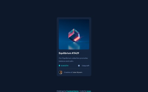
Submitted almost 4 years agoA solution to the NFT preview card component challenge
NFT-Card Active Hover State with CSS Pseudo-Elements
@kxnzx

Solution retrospective
Hello mentee's!
- I thought it was about time to learn about SASS and incorporate the extension into this challenge. So far I have learned about the SCSS syntax such as variables, extend, mixins and @use. I was not able to use the latter, because the VSC LIVE SASS Compiler version I used is depreciated. Next time I'll install the original version so that I can make partials. My variables:
// primary colors
$primary_clr_blue: #8bacda;
$primary_clr_cyan: #00fff7;
// neutral colors
$main_bg_clr: #0d192b;
$card_bg_clr: #14253d;
$line_clr: #2f415b;
$white_clr: #ffffff;
// Typography
// font-family
$ff_primary: "Outfit", sans-serif;
// font-weight
$fw_light: 300;
$fw_regular: 400;
$fw_semi_bold: 600;
// font-size
$fs_18px: 1.125rem;
- I learned how to work with Pseudo-elements: the "Active Hover State" was the most challenging part of this work. Inserting a relative path of an svg into CSS did not work in my case. The solution for this was to convert the code.
.card_showcase {
      position: relative;
      cursor: pointer;
      border-radius: 10px;
      overflow: hidden;
      &::after {
        content: url("data:image/svg+xml,%3Csvg width='48' height='48' xmlns='http://www.w3.org/2000/svg'%3E%3Cg fill='none' fill-rule='evenodd'%3E%3Cpath d='M0 0h48v48H0z'/%3E%3Cpath d='M24 9C14 9 5.46 15.22 2 24c3.46 8.78 12 15 22 15 10.01 0 18.54-6.22 22-15-3.46-8.78-11.99-15-22-15Zm0 25c-5.52 0-10-4.48-10-10s4.48-10 10-10 10 4.48 10 10-4.48 10-10 10Zm0-16c-3.31 0-6 2.69-6 6s2.69 6 6 6 6-2.69 6-6-2.69-6-6-6Z' fill='%23FFF' fill-rule='nonzero'/%3E%3C/g%3E%3C/svg%3E");
        background: hsla(178, 100%, 50%, 0.5);
        position: absolute;
        inset: 0;
        display: flex;
        justify-content: center;
        align-items: center;
        opacity: 0;
        transition: all 0.25s ease;
      }
      &:hover::after {
        opacity: 1;
      }
- The property and value " inset: 0; " is the same as:
.example {
  position: absolute;
  top: 0;
  right: 0;
  bottom: 0;
  left: 0;
}
- Note to Self: In hindsight it would have been better if I put the element selector "card_metrics" into an unordered list with list items and style them in CSS with the ::marker pseudo-element.
<ul class="card_metrics">
  <li><span class="card_metrics_points">0.041 ETH</span></li>
  <li><span class="card_metrics_clock">3 days left</span></li>
</ul>
Feel free to comment/feedback!
Code
Loading...
Please log in to post a comment
Log in with GitHubCommunity feedback
No feedback yet. Be the first to give feedback on kxnzx's solution.
Join our Discord community
Join thousands of Frontend Mentor community members taking the challenges, sharing resources, helping each other, and chatting about all things front-end!
Join our Discord