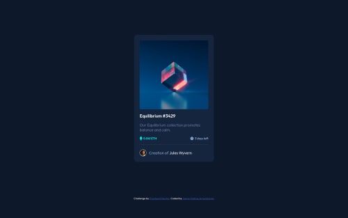
Not Found
Not Found
Not Found
Not Found
Not Found
Not Found
Not Found
Not Found
Not Found
Not Found
Not Found
Not Found
Not Found
Not Found
Not Found
Not Found
Not Found
Not Found
Not Found
Not Found

Submitted

NftCardEx-Jaal

#express

@jaimeandres77

Desktop design screenshot for the NFT preview card component coding challenge

This is a solution for...

  • HTML
  • CSS
1newbie
View challenge

Design comparison


SolutionDesign

Solution retrospective


Does the end result looks like the expected one? How can I improve in terms of responsive web design?

Community feedback

P
David Turner 4,110

@brodiewebdt

Posted

Everything on the card looks good. Put the background-color on the body instead of the main tag and will cover the entire view-port. Change your H2 to an H1. Every page should have an H1 for accessibility reasons. Use the same styles that you have on the H2 with the H1 and you won't have to re-style. Change the attribution div to a Footer and it will clear the accessibility warnings.

Hope this helps.

Marked as helpful

2

@alQaisi

Posted

I noticed that you used flex on the logo-text-container to make it look better I suggest to add "align-items:center" it should look better especially on mobile devices and you can reduce the font-weight in that class to make it look more like the challenge's screenshots

Marked as helpful

0

Please log in to post a comment

Log in with GitHub
Discord logo

Join our Discord community

Join thousands of Frontend Mentor community members taking the challenges, sharing resources, helping each other, and chatting about all things front-end!

Join our Discord