NFT-card-grid-flexbox

Solution retrospective
This was my first challenge on Frontend Mentor. I would be greatly appreciative if anyone can review the way I used Flexbox and Grid together and provide feedback whether there is a better solution that what I used.
Basically, I used a large Flexbox column (body tag), Grid within the main box (container), and two Flexboxes: (1) Area with the ethereum and clock icons (2) Avatar and author area
Any other feedback would be greatly appreciated!! I am sure there are ways my code could be more concise.
Thanks!!
Please log in to post a comment
Log in with GitHubCommunity feedback
- @remusbuhaianu
Congrats on completing your first Frontend Mentor challenge, Brandon!
It must've been quite challenging, but you've successfully made it and with each project you complete, you become a more competent and capable developer.
Regarding what you said, there are many ways to approach a project. Obviously, there are some "best practices" commonly agreed on, but other than that, a lot of stuff in the coding world is subjective. It's important to realize that how someone coded a project isn't necessarily the best or the only way to do it.
Now, I've had a look at your design and I looked through your code as well. Here are a few suggestions / observations based on that, in no particular order:
-
I like how you structured your HTML - it's easy to read through. You might want to check out the BEM methodology for naming your classes and also look into HTML Semantic elements as they are a best practice when it comes to structuring your code for SEO and accessibility.
-
On the smaller device sizes, there's an issue with the scaling of the card that creates a horizontal scrollbar. You might want to consider adding a media query to resize the card, so it fits the smaller viewports, without causing any scrolling.
-
Consider using the * selector to target all elements when using the border-box property and also resetting the margin and padding for all the elements on the page as shown in this example https://stackoverflow.com/questions/46923610/css-resetting-margin-and-padding/46923672
-
You added the display: grid property on the container, but that in itself doesn't affect the layout of the page. Therefore, making it redundant.
-
You can create the hover effect just using the ::after and ::before pseudo-elements. You can have a look at how I did here https://github.com/Remus432/nft-preview-card-component/blob/main/styles.scss
-
Consider using relative units such as %, rem, vh, and vw when building your UIs instead of px. That'll allow you to build more responsive and robust UIs that look great on all devices.
-
Instead of using display: flex on the body element, you can use display: grid and the place-content: center properties to align vertically and horizontally your card.
-
I like how you used @import for the Google Fonts - it's a neat way to keep your code more organized. (P.S: I might be biased because that's how I also approach Google Fonts imports ;))
-
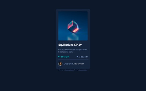
You set the height to auto on the equilibrium image, but that's redundant since the browser automatically calculates the height of the image based on the width. You don't need that line of code there.
All in all, you've done a great job for your first Frontend Mentor challenge and I like how you've organized your HTML and CSS. You're on the right path and with each challenge, you'll continue sharpening your skills.
Keep up the good work, Bradon! ;)
Marked as helpful -
- @Mariam-Rf
Hello Brandon, I read your CSS and it's perfectly made. I have a note about the view icon because the most common solution is to add an overlay (div) on top of the image, with the icon inside of it. But the way you approached it is smart too and I like it. There's no better solution if you get right, it's just different approaches. Also, I think when it comes to grid, it's mainly left to a more complex layout with many columns and rows. That's the general opinion about it. I hope this helps and good luck :)
Marked as helpful


Join our Discord community
Join thousands of Frontend Mentor community members taking the challenges, sharing resources, helping each other, and chatting about all things front-end!
Join our Discord