
Please log in to post a comment
Log in with GitHubCommunity feedback
- @cristianbarreiro
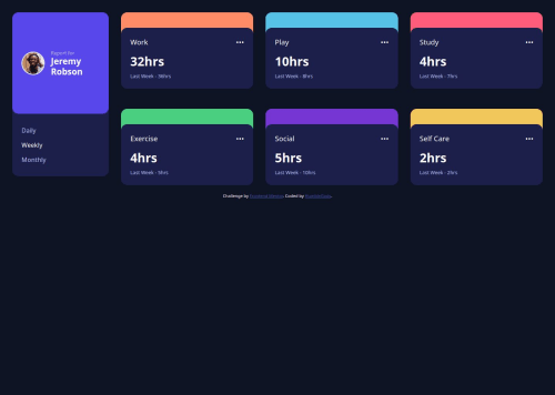
To improve the layout, I recommend centering the entire dashboard container more precisely by using flexbox on the body (or a wrapper) with justify-content: center and align-items: center. This ensures the dashboard stays centered both vertically and horizontally in the viewport.
Additionally, setting a max-width on the dashboard container (e.g., max-width: 800px) helps control its size on large screens, preventing it from stretching too wide and improving readability.
Example approach:
css Copiar Editar body { display: flex; justify-content: center; align-items: center; min-height: 100vh; padding: 2rem; }
.dashboard { width: 100%; max-width: 800px; display: grid; grid-template-columns: 250px 1fr; gap: 2rem; } This combination creates a balanced, centered layout with a consistent max width and good spacing, improving the overall user experience and appearance across devices.

Join our Discord community
Join thousands of Frontend Mentor community members taking the challenges, sharing resources, helping each other, and chatting about all things front-end!
Join our Discord