Normal internal CSS with media query for margin

Solution retrospective
How can I make it better? I would appreciate the tips.
Please log in to post a comment
Log in with GitHubCommunity feedback
- @vanzasetia
Hello there! 👋
Congratulations on completing your first Frontend Mentor challenge! 🎉
Here are some recommendations for improvements.
- I recommend moving all the styling to a separate CSS file. It's not a big deal for this challenge however, it's best to practice this so that you start having a habit of doing this. 🙂
- I suggest removing the media query by finding an ideal value for the
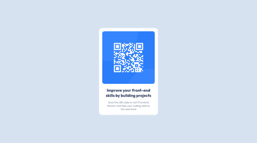
marginof thecontainer. Maybe around1.5emwould be good for both desktop and mobile layout. - The QR code is an important image for this challenge so it needs an alternative text. Without alternative text, the image will not be pronounced by screenreaders.
That's it! I hope you find this useful! 🙂
Marked as helpful - P@natashapl
Hi Atul! I ditto everything that Assurance said. I'd also suggest looking into the main tag and some other HTML 5 semantic tags. Here's an article that gives a good overview:
Marked as helpful - @Aik-202
Hi Atul, this is pixel perfect!!!! 😍😍😍. But I have some suggestions that can help you with your accessibility issues.
-
You can change that div with class big container to main, as your code must have one main tag or you can add this to big container
role = 'main'. Then the big container will be treated as main -
Change the h2 tag to h1, you can give it any font size in your css.
-
Attach
aria rolesto each of your divs. I think the aria role to be used for the div with class container is group i.erole = 'group'. Click on this link to know more about aria roles
Hope this helps.
-


Join our Discord community
Join thousands of Frontend Mentor community members taking the challenges, sharing resources, helping each other, and chatting about all things front-end!
Join our Discord