Not Found
Not Found
Not Found
Not Found
Not Found
Not Found
Not Found
Not Found
Not Found
Not Found
Not Found
Not Found
Not Found
Not Found
Not Found
Not Found
Not Found
Not Found
Not Found
Not Found

Submitted

Not my best work

Adler G Ludersβ€’ 1,580

@adluders

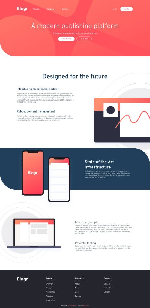
Desktop design screenshot for the Blogr landing page coding challenge

This is a solution for...

  • HTML
  • CSS
  • JS
2junior
View challenge

Design comparison


SolutionDesign

Solution retrospective


I feel like this was not my best work considering I just wanted to do it as a quick distraction. Please give feedback on what I could've improved. I feel like there might be plenty

Community feedback

P
ApplePieGiraffeβ€’ 30,565

@ApplePieGiraffe

Posted

Hello there, adluders! πŸ‘‹

Good effort on this challenge! πŸ‘

A few things I suggest are,

  • Making sure the navigation links in the footer of the page of the mobile layout are actually links by using the anchor tag to create them.
  • I think closing any other open submenus in the header of the page when another submenu is opened would be a good idea (rather than having them all open at the same time).
  • Adding some margin/padding around the paragraphs on the page so that there's some space between them and the edges of the screen in the mobile layout. πŸ˜‰

Keep coding (and happy coding, too)! 😁

1

Adler G Ludersβ€’ 1,580

@adluders

Posted

@ApplePieGiraffe thanks for the detailed feedback as always. And yeah I was being lazy πŸ˜‚πŸ˜‚. After finishing the challenge I'm currently working on, I plan on refactoring this and three other projects that I submitted. Btw are you on slack? I would love to connect with you.

1
P
ApplePieGiraffeβ€’ 30,565

@ApplePieGiraffe

Posted

@adluders

No problem! πŸ‘ Yeah, I'm on the Frontend Mentor Slack communityβ€”feel free to DM me there @ApplePieGiraffe! πŸ˜€

0

@YoussefMohamed2k19

Posted

Good Solution @adluders but you should decrease width of laptop image alt="laptop graphic" at responsive screens

1

Adler G Ludersβ€’ 1,580

@adluders

Posted

@YoussefMohamed2k19 the width of the image?

0
Adler G Ludersβ€’ 1,580

@adluders

Posted

@YoussefMohamed2k19 I think the laptop image should actually be gone on mobile. What screen size are you using?

0
Adler G Ludersβ€’ 1,580

@adluders

Posted

@YoussefMohamed2k19 NVM I see what you mean. πŸ€¦πŸΎβ€β™‚οΈ

0

Please log in to post a comment

Log in with GitHub
Discord logo

Join our Discord community

Join thousands of Frontend Mentor community members taking the challenges, sharing resources, helping each other, and chatting about all things front-end!

Join our Discord