
Solution retrospective
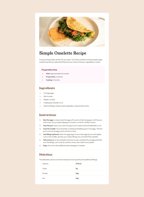
Great first attempt at HTML & CSS! I've reviewed the Figma designs and my work so I'm happy with the outcome. One issue that still persists is the position of the bullet points (UL or LI) on the mobile version.
When the text in the preparation time and ingredients section gets smaller the text goes to 2 lines. At the moment my bullet point remains inline with the top line but on the Figma design it's centred. I did look into this online but I couldn't find a solution.
What specific areas of your project would you like help with?The position of the bullet points on the mobile version in the preparation and ingredients sections.
Please log in to post a comment
Log in with GitHubCommunity feedback
No feedback yet. Be the first to give feedback on Philmc4's solution.
Join our Discord community
Join thousands of Frontend Mentor community members taking the challenges, sharing resources, helping each other, and chatting about all things front-end!
Join our Discord