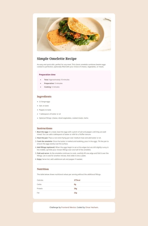
Omelette Recipe with HTML & CSS: Responsive Design, Mobile-Friendly

Solution retrospective
I am most proud of successfully creating a responsive design that adapts well to different screen sizes while maintaining a clean and user-friendly layout. The use of HTML and CSS to achieve this was a valuable learning experience. Next time, I would focus on enhancing the accessibility of the page by implementing ARIA roles and ensuring better keyboard navigation for users with disabilities.
What challenges did you encounter, and how did you overcome them?One challenge was ensuring the design looked good on both desktop and mobile devices. To overcome this, I used media queries to adjust font sizes, margins, and layout elements, making the page responsive. I also optimized images and tested the design on different screen sizes to ensure a consistent and user-friendly experience.
What specific areas of your project would you like help with?I would appreciate feedback on the responsiveness and overall layout of the page, particularly how it performs on smaller screens. Additionally, any suggestions for optimizing the CSS for better performance and code cleanliness would be helpful.
Please log in to post a comment
Log in with GitHubCommunity feedback
No feedback yet. Be the first to give feedback on Omar Hesham's solution.
Join our Discord community
Join thousands of Frontend Mentor community members taking the challenges, sharing resources, helping each other, and chatting about all things front-end!
Join our Discord