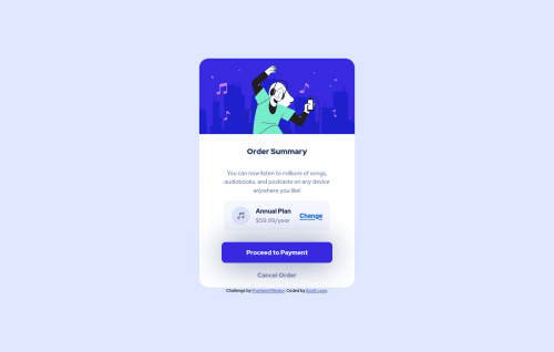
Order Component Using HTML CSS and Flexbox

Solution retrospective
I know the colour on the hover states is incorrect. But I just could not figure out the correct colour scheme to use.
Also, I am a bit concerned that the sizing of the design. It is massively different to the design brief. In the real world, would this be a major concern? If so, are there any websites that can scale images and give the correct pixels for my future design???
Again, thank you for all that will review my code and give feedback.
Please log in to post a comment
Log in with GitHubCommunity feedback
- @FluffyKas
Heyo,
It's not a bad start but there's a few issues going on here ^^
-
Using vw isn't a great solution for defining a width, at least not in itself. Your
max-widthshould always be a fixed height, 30rem/400px for example (or whatever fits this challenge) . If this doesn't alone solve your problems, you can combine it with awidth: 90%(just an example, again), the two together will take care of your widths on most screen sizes ^^ -
Don't give the
bodyaheight, usemin-heightinstead. -
Alt texts shouldn't contain the word image, picture etc, using an img element is self-explanatory. It's just supposed to be a text description for those who can't see the image, so "A lady listening to music via headphones" is perfect ^^
-
Giving your images a
display: block,max-width: 100%andheight: autowill make sure they resize in a responsive way, you'll rarely ever need more than this. Your size problems right now come from other sources, like the widths on your containers. -
As for the button hover, I'd just keep the same colour and lower to opacity to like 0.8 on hover. Lowering opacity is frequently used for hovers, so just keep this in mind if you feel like you're struggling to come up with the "right colour".
-
The box-shadow on the button also seems a bit off, try this instead:
box-shadow: 0 15px 20px 0 hsla(245, 75%, 52%, .25). Reducing opacity on the colour is a great trick here too, if you'd like to make more realistic box-shadows.
Marked as helpful -
- @byronbyron
Hey @TotallySly, it looks alright!
For the button hover, I used a slight opacity instead of the background colour, something like:
.payment--container button:hover,
.payment--container button:focus {
    opacity: 0.75;
}
For the sizing thing, it depends on how picky your client is in the real world 😅. When I want to get the image size from the design image, I usually open it up in Preview (mac) and drag a square around the image to get the dimensions.
For your Order Component, it looks like your background images aren't coming through. Something like this should help I think (feel free to play around with the background-size values):
body { ... background: url(images/pattern-background-mobile.svg) no-repeat, top center hsl(225, 100%, 94%); background-size: 100% 194px; } @media screen and (min-width: 908px) { body { background-image: url(images/pattern-background-desktop.svg); background-size: contain; }Marked as helpful


Join our Discord community
Join thousands of Frontend Mentor community members taking the challenges, sharing resources, helping each other, and chatting about all things front-end!
Join our Discord