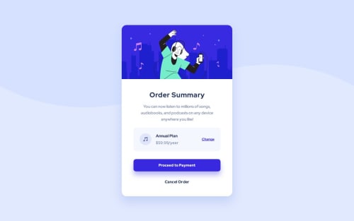
Order summary card

Solution retrospective
I was struggling placing the background svg image on the page. The solution was very simple, change background-size from cover to contain. It took me awhile because I've never used background-size: contain, didn't even knew it existed.
Please log in to post a comment
Log in with GitHubCommunity feedback
- @devaramnye
I recommend to work on your accessibility. I am working as well hard to understand it right as it would be a huge gap learning it correctly. I do not know if you always work with div's as I only review this project but HTML5 allowes us to easily organize our HTML with landmarks. I like your project and the matching design with the original part. I love your work and its just a little reminder that I focuse by myself and want to give it to you as well for your future works.
Marked as helpful - @fernandolapaz
Hi 👋, just a few things that may interest you:
- It is better to use
min-height: 100vh;as usingheightcauses the page to be cut off in viewports with small height (such as mobile landscape orientation).
- You might consider using relative units like rem or em since they are better for scalable layouts. Something simple to start with would be to convert to rem (1 rem equals the font size of the root element, 16px by default). Consider this suggestion especially for the
font-size.
- It might be good to get used to designing with the mobile first approach, which means designing for mobile first and then for desktop or any other device, as it is widely considered best practice.
Please let me know if you want more info on any of these topics or disagree with something. I hope it’s useful : )
Nice solution btw.
Regards,
- It is better to use


Join our Discord community
Join thousands of Frontend Mentor community members taking the challenges, sharing resources, helping each other, and chatting about all things front-end!
Join our Discord