Not Found
Not Found
Not Found
Not Found
Not Found
Not Found
Not Found
Not Found
Not Found
Not Found
Not Found
Not Found
Not Found
Not Found
Not Found
Not Found
Not Found
Not Found
Not Found
Not Found

Submitted

Order summary card component

#bootstrap#styled-components#accessibility

@yonigold

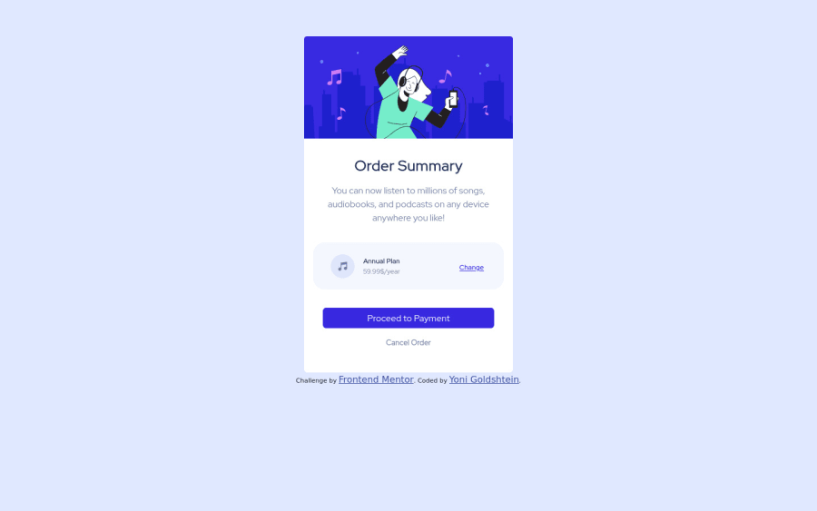
Desktop design screenshot for the Order summary component coding challenge

This is a solution for...

  • HTML
  • CSS
1newbie
View challenge

Design comparison


SolutionDesign

Solution retrospective


Hi ! This was a nice challenge, I did it with bootstrap for practice and i think it went really well. Im looking for ways to improve my code, how to make it more cleaner, more good-looking and in general any advice on the code will be great. Thanks.

Community feedback

Asif Ali 130

@drAsifAli123

Posted

Hi @yonigold Your design looks good but you need to tweak few properties to change your design.

  1. wrap "Annual plan" into h2 heading.
  2. instead of using ".prices { font-size: 12px;}" use ".prices { font-size: 1rem;}".
  3. do the same font size change to ".prices2" class.
  4. wrap the price into p tag.
  5. make a single div and put your "Annual plan" and "price" into this single div and give only one class to this div to refactor your code.
  6. give small padding to "div class="prices""
  7. instead of giving change class to div, give this class to anchor tag and give a hover over pseudo class to change the color property and text-decoration to none;
  8. give a hover class to "cancel order" anchor tag to change the color on hover over.

I hope this will help you to improve your practice; and like this post if it helps you;

Happy Coding🎈

Marked as helpful

1

@yonigold

Posted

@drAsifAli123 Thank you very much for the review ! I find it very helpful !

0
kxnzx 870

@kxnzx

Posted

Hello Yonatan,

Well done finishing your third challenge! I have some suggestions...

  • I would wrap the title in a H1, because it is the most important heading on the page. This helps the search engines understand what the page is about. Besides that it helps (screen)readers understand the hierarchy of the page. Always first start with a H1 and follow it up with a H2 etc. in case you have subheadings.
  • I also would wrap the attribution in a footer tag.

Marked as helpful

1

@yonigold

Posted

@kxnzx Thank you very much for the review ! I find it very helpful !

0
kxnzx 870

@kxnzx

Posted

@yonigold Glad it helped! :)

0

Please log in to post a comment

Log in with GitHub
Discord logo

Join our Discord community

Join thousands of Frontend Mentor community members taking the challenges, sharing resources, helping each other, and chatting about all things front-end!

Join our Discord