Not Found
Not Found
Not Found
Not Found
Not Found
Not Found
Not Found
Not Found
Not Found
Not Found
Not Found
Not Found
Not Found
Not Found
Not Found
Not Found
Not Found
Not Found
Not Found
Not Found

Submitted

Order summary card solution

@codeFliers

Desktop design screenshot for the Order summary component coding challenge

This is a solution for...

  • HTML
  • CSS
1newbie
View challenge

Design comparison


SolutionDesign

Solution retrospective


I still want to use vanilla CSS. I have trouble with the center where i used 3 floats left with width %. Is there a better solution ?

Community feedback

@gmcodes20

Posted

Hello @codefliers, nice one you got here.

Maybe some few issues that shouldn't be hard to fix.

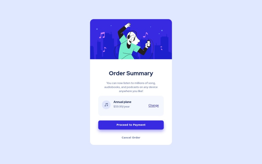
First, you page should have some margins from the screen. I.e it is too close to the edge of the screen.

Secondly, to center an element, you can use margin auto and specify the width of element. You can also choose either css grid or css Flexbox (checkout this course on grid for more insight https://www.cssgrid.io )

Last but not the least, you cannot nest link inside a button or vice versa just like you did here <button1><a href=https://www.frontendmentor.io?ref=challenge>Proceed..... It should be a button or a link but not both nested.

Marked as helpful

0

@gmcodes20

Posted

@gmcodes20 https://flexbox.io/ for Flexbox

0
saira 130

@saira512dev

Posted

Flexbox is a better choice

0

@JonathanRe

Posted

Look into flexbox for the items in the center of the card. You can also use it to center the card in the page, so you don't have to use position: absolute;

0

Please log in to post a comment

Log in with GitHub
Discord logo

Join our Discord community

Join thousands of Frontend Mentor community members taking the challenges, sharing resources, helping each other, and chatting about all things front-end!

Join our Discord