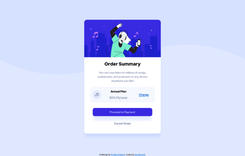
Order Summary Card using Hover Sates for Links

Solution retrospective
THINGS I'M NOT SURE OF:
Hero Image border radius - I had to apply the border radius to both the DIV and the IMG. Is there a way to do this just once?
There is also 3.600 white line at the bottom - unsure of how it got there...setting display: block; removed it. But I just dont' know why that happens. (similar issue in the NFT card challenge)
For the 'annual plan' and 'price' text, I want them so the top of ANNUAL PLAN is perfectly aligned to the top edge of the music icon, and the bototm of the price is perfectly aligned to the the bottom edge of the music icon. Right now I could only figure out how to fudge with adding a bottom margin to the h2 - but that feels like a sloppy way of accomplishing this.
Still having trouble matching box shadow styles.
Also, I think the design elements for this challenge are off. The colors provided did not match the design images (see the hover state of the payment button) and the font definitely appears to be different than the one it says to use.
Please log in to post a comment
Log in with GitHubCommunity feedback
No feedback yet. Be the first to give feedback on Dan Bennett's solution.
Join our Discord community
Join thousands of Frontend Mentor community members taking the challenges, sharing resources, helping each other, and chatting about all things front-end!
Join our Discord