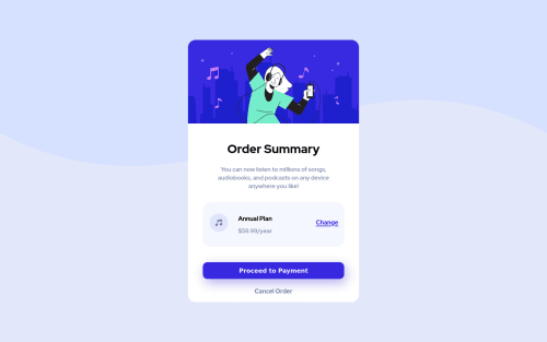
Order Summary Card using HTML and CSS

Solution retrospective
- Is the approach of using variables instead of hardcoding the pixel values, the right way?
- I wanted to experiment with CSS positions and had to customize few things to make it work for mobile layout. Is there any best practice like when to use CSS positions, Floats and when to use FlexBox?
Please log in to post a comment
Log in with GitHubCommunity feedback
- @Da-vi-de
Hi Nayana, the overall result is nice, it looks good on desktop but i can't say the same for mobile screen.
-
Experimenting is always a great thing because it means you are curious and you want to understand deeply what you do. This is the kind of attitude that allow you to grow, well done :-)
-
Now i tell you what i learned (and i'm still learning) about positioning! Basically position absolute, relative, block are not longer in use when the main goal is to make something responsive, so a good question to ask to yourself (before starting the project) would be: Do the items need to be responsive? If so, then the best choice is to apply flexbox or grid technique! Rarely you need positioning items with float etc.. But it happens! The main focus though it must be responsiveness. The problem in your implementation is also the workflow, it's not mobile first! I suggest you to change approach, you will understand the benefit of doing so!
-
Honestly it's the first time i saw variables written that way, i'd rather write variables for
--font-size. Usually larger projects have lots of different measures. Personally i wouldn't do the way you do, it's very time consuming.
Hope it helps a little, keep coding :-)
Marked as helpful -

Join our Discord community
Join thousands of Frontend Mentor community members taking the challenges, sharing resources, helping each other, and chatting about all things front-end!
Join our Discord