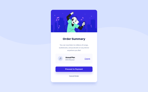
Order summary card using HTML5, CSS and BEM

Solution retrospective
Hi everyone,
Here is my first challenge. I really enjoyed working on it and would greatly appreciate as much feedback as possible.
The one component I struggled with the most was the background wave image, I wasn't sure how to introduce it and eventually settled on including it as a background-image in the CSS file. I did find it difficult to adjust it properly to the layout and I'm not entirely happy with how it turned out, I think it could have been done a lot better, I'm curious to know what your thoughts are on my solution for this particular element, and what you would have done differently -->
.bg-image { position: absolute; background-image: url(images/pattern-background-mobile.svg); background-repeat: no-repeat; background-size: 100%; z-index: -1; width: 100%; height: 100%; }
There's two problems I have with it so far:
-
How it looks on the desktop view: I don't think it matches the design perfectly nor does it on the mobile view to be fair.
-
How it looks on mobile devices: when I viewed the completed design on my iPhone 8, annoyingly I could move the screen up and down and this ruined the design as the card was static on the centre of the screen with blank space above or below as I moved it.
Please do let me know if anyone had the same problems or what your solution would be for this.
** I also viewed the finished design on a larger iPhone 11 and again it looked way off because the viewport was vertically a lot larger which left blank space on the top and bottom.
Please log in to post a comment
Log in with GitHubCommunity feedback
No feedback yet. Be the first to give feedback on Alejandro's solution.
Join our Discord community
Join thousands of Frontend Mentor community members taking the challenges, sharing resources, helping each other, and chatting about all things front-end!
Join our Discord