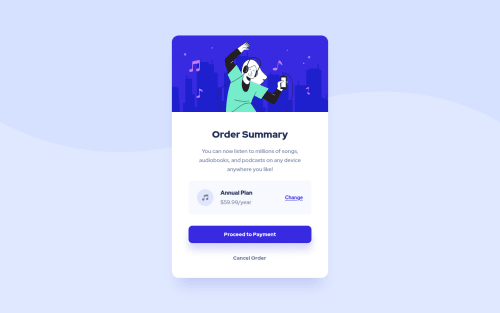
Order Summary Card with CSS FLexbox

Solution retrospective
This is my first submission on Frontend Mentor.
Would appreciate feedback on my HTML structure and CSS as well. I feel that I wrote too much code and could maybe have simplified it better.
Thanks for any feedback!
Please log in to post a comment
Log in with GitHubCommunity feedback
- @AlexKMarshall
Others have commented about the CSS, so I'll focus on the HTML.
You have used a lot of divs. Instead of those you should try to use semantic elements. For instance instead of
<div class="container">
<main>
would be more appropriate. And<h1>
should be the tag for the Order Summary title.You've wrapped your
<a>
tags in a<div>
. Because you've done that, you can only click on the text, not the surrounding blue background. Instead of doing that, setdisplay: block
on the<a>
element and just style that, remove the div.Marked as helpful - @BenConfig
Using
position: absolute;
on every element is not a good idea. You will see this is a problem when you try it with larger projects which need to be responsive.Almost all positioning can be done with a combination of
grid
,flex
,padding
andmargin
.Marked as helpful - @itsrafsanjani
Your design looks perfect. But did you manually calculate those
bottom, left, right, top
? If yes then stop doing that. Try to useflex
orgrid
as much as possible. So that other developers can read and modify your code easily. And usehref="#"
if you don't know the link.Marked as helpful - @michaella23
wow! it looks so close to the original. how did you choose the color for the box-shadows? I thought it would be one of the custom colors from the design file, but I couldn't ever get mine to look quite right.
Join our Discord community
Join thousands of Frontend Mentor community members taking the challenges, sharing resources, helping each other, and chatting about all things front-end!
Join our Discord