Submitted almost 2 years agoA solution to the Order summary component challenge
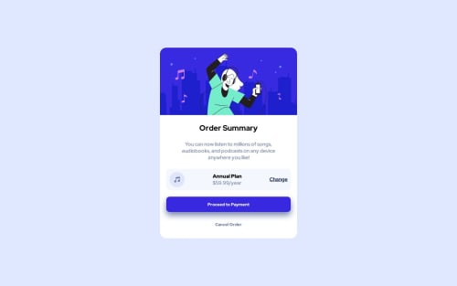
Order summary component

@JaroslavHosovsky
Solution retrospective
I will be glad for any feedback
Code
Loading...
Please log in to post a comment
Log in with GitHubCommunity feedback
- @VickyAzola
Hi, great work finishing this challenge. Your desing looks realy good! Here are a few tips I can give you:
- Try to use
<main></main>to wrap your main content for accessibility purposes. Here is a link to more information on the use of semantic HTML - To center your card vertically and horizontally, you can use flex or grid on the body. And delete the
marginon the.card-container - The design has a background image; you can add this to your CSS:
body { // to center the card min-height: 100vh; display: grid; place-content: center; //to add the image background: url(images/pattern-background-desktop.svg); background-color: hsl(225, 100%, 94%); background-size: contain; background-repeat: no-repeat; } .card-container { width: 85%; margin: 70px auto; //delete this text-align: center; background-color: hsl(0, 0%, 100%); border-radius: 20px; }- if you are using the same 20px for the border top, there is no need to specify it for left and right separately; just use the
border-radius, like this:
.hero-img {
  width: 100%;
  height: auto;
// top-left | top-right | bottom-right | bottom-left //
  border-radius: 20px 20px 0 0;
}
Hope this helps! 🤗
Marked as helpful - Try to use

Join our Discord community
Join thousands of Frontend Mentor community members taking the challenges, sharing resources, helping each other, and chatting about all things front-end!
Join our Discord