Submitted over 3 years agoA solution to the Order summary component challenge
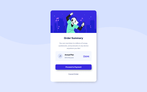
Order summary component. NO RESPONSIVE

@Niko0918
Code
Loading...
Please log in to post a comment
Log in with GitHubCommunity feedback
- @alexattt
Great job!!!
One thing - you might want to add some left and right margin for the card/change card width a little bit so it is not 100%, for mobile screens. I opened it from my phone, and although it doesn’t look bad, it would look slightly better if there was some left and right space :)
Marked as helpful

Join our Discord community
Join thousands of Frontend Mentor community members taking the challenges, sharing resources, helping each other, and chatting about all things front-end!
Join our Discord