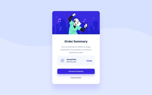
Order Summary Component

Solution retrospective
2 problems so far:
I didn't know how to group the "Music Icon" and "Annual Plan" together while having the whole row justified and vertically centered at the same time.
I used these rules to vertically centre my content in the body: body { position: absolute; top: 50%; left: 50%; transform: translate(-50%, -50%); }
The problem with this is that when I make my browser screen really short, let's say less than 500px, the top of the content starts to cut off and it won't scroll up.
So I fixed it by creating conditional CSS where I monitor the height of the screen. This is not elegant and I feel deeply ashamed :) Any advice on how to actually stick the content to the top of the screen, when the viewing height becomes too small, with the possibility to scroll, would be much appreciated.
Please log in to post a comment
Log in with GitHubCommunity feedback
- @denielden
Hey Arthur, congratulations on completing the challenge! You did a great job 😉
Let me give you some little tips for optimizing your code:
- add
maintag and wrap the card for improve the Accessibility - for fix the top image in the background just put more specific background properties to the body:
background: url("../img/pattern-background-desktop.svg") no-repeat top center; background-size: contain; background-color: #e0e8ff;- remove
marginfrom body to remove the scroollbar of browser - use
min-height: 100vhand notheight - add
transitionon the element with hover effect - instead of using
pxuse relative units of measurement likerem-> read here
Hope this help! Happy coding 😁
Marked as helpful - add
- @vanzasetia
Hello, Arthur! 👋
Regarding the problem that you have:
- The music icon has a line height, maybe because the
imgelement is an inline element. So, I recommend making theimgelement as a block element and (probably) settingline-height: 0would solve the problem. - I highly recommend making the
bodyelement as a flexbox container to center the child element which should be the card element. Then, setmin-height: 100vh;(**notheight) to make the card vertically center and allow thebodyelement to grow if needed. So, the point is to usemin-heightand flexbox instead. Also, add somepaddingas well to prevent the card from having full width on the small screen size.
Some feedback from me.
- All images on this site are decorative images. So, I recommend leaving the
altempty. - Don't use
brelements for presentational purposes. Read what MDN documentation says about it. I would recommend making thespanas block element to move the text to another line. - Always specify the
typeof thebutton. In this case, set the type of them astype="button". It's going to prevent the button from behaving unexpectedly. - I would highly suggest using HTML native element instead of
roleattribute. It's best to use the native HTML element whenever possible.
That's it! Hope you find this useful!
Marked as helpful - The music icon has a line height, maybe because the
- P@ArthurPog
Btw, does anyone have any clue why my generated screenshot is offset vertically by approximately 10 pixels? I have this with every project :)


Join our Discord community
Join thousands of Frontend Mentor community members taking the challenges, sharing resources, helping each other, and chatting about all things front-end!
Join our Discord