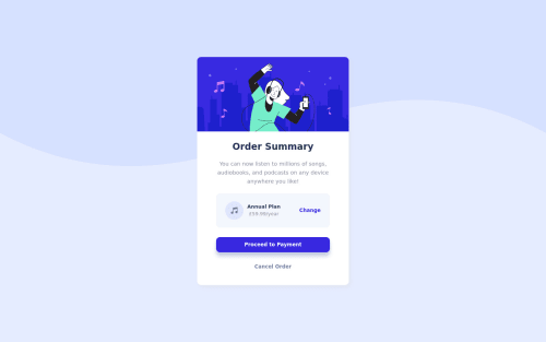
Order summary component

Solution retrospective
Hi!
Just completed this project. I'm happy with the end product but would appreciate any feedback for anything you feel could be done better.
I've added a media query for mobile and it looks fine in dev tools but I'm not sure if my method is the most efficient way of approaching this?
Thanks
Please log in to post a comment
Log in with GitHubCommunity feedback
- @pikapikamart
Hey, awesome work on this one. Layout in general looks great.
Others already gave their feedback on this one, just going to add some suggestions as well:
- Right now, if you hover on the
htmltag orbody, you will notice that it has no height since the main component is usingposition: fixedwhich takes an element out of the flow. Avoid using this orposition: absolute. Since you are using this to only center the content, it will be better to do it this way, but first, remove all these properties on the.cardselector:
left
top
position
transform
and on the
bodytag add these:align-items: center; display: flex; justify-content: center; min-height: 100vh; # so that flexbox will have enough height to center verticallyThis is more consistent as this will always center the content and you avoided using
positionproperty on the layout.- Vector image should be hidden since it is only decoration. Decorative image must be hidden at all times for screen-reader users by using
alt=""and extraaria-hidden="true"attribute on theimgtag. - Also when using
altattribute, avoid using words that relates to "graphic" such as "background" and others. Animgis already an image/graphic so no need to describe it as one. - A page must have a single
h1on a page. Since there are no text-content that are visible that could beh1, you will make theh1screen-reader only text. Meaning this will be hidden for sighted users and only be visible for screen-reader users, search aboutsr-onlystylings and see how it is used. Theh1text should describe what is the main content is all about, thish1would be placed as the first text-content inside themainelement.Have a look at this simple snippet of mine implementing the sr-only heading tag. I already added some comments in the markup so that it will be easy to understand^^. - Music-icon should be hidden as well using the method I mentioned.
- When wrapping a text-content do not just use
spanto wrap it, use meaningful element like aptag if it just a regular text or heading tag if it is an heading. annual-plancould use a heading tag since it gives information on what the section would/could contain, hence the pricing for such plan the user has chosen.
Aside from those, great job again on this one. If you have any queries just let me know.
Marked as helpful - Right now, if you hover on the
- @kens-visuals
Hey @GitNutts 👋🏻
I have some suggestions to help you fix the accessibility issues and some other things.
- In HTML,
<div class="card">...</div>should be<main class="card">...</main>. This will fix the accessibility issues, just, don't forget to generate a new repot once you fix the issues. - For the music icon, add
aria-hidden="true”, because it's for decoration. You can read more aboutaria-hiddenhere. - Also, I suggest adding
transition: all 0.2s;to the button and the links, this will make:hoversmoother
I hope this was helpful 👨🏻💻 and to answer your question, yes, your approach is good enough, but I'd suggest learning mobile first approach of building websites. That's more efficient and, a lot easier than, the traditional approach (desktop first). Other than that, you did a great job for the first project, keep it up. Cheers 👾
Marked as helpful - In HTML,
- @dovelm
Excellent!!, very good in mobile


Join our Discord community
Join thousands of Frontend Mentor community members taking the challenges, sharing resources, helping each other, and chatting about all things front-end!
Join our Discord