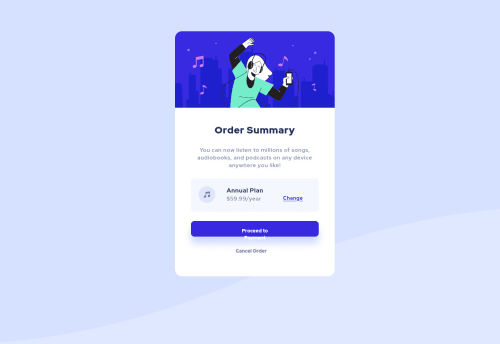
Order summary component

Solution retrospective
Hello, I hope you like it! Any advice will be appreciated :)
I'm not satisfied with the Payment button. Anyone know how to fix this? The text won't be inline and it still won't work after adding max-height to the button.
Also 'Change' is not inbetween 'Annual plan' and '$59.99/year'
Please log in to post a comment
Log in with GitHubCommunity feedback
- @elaineleung
Hey Jennifer, good job in attempting this challenge. Regarding the button, I'd first remove the
max-heightand change the padding, then add a width of 100%:.button { width: 100%; padding: 1rem; // be sure to remove the max-height! }
There are a number of positioning and sizing issues that are greatly affecting the responsiveness of your site. What I would do is:
- Remove the
width: 32vwon thesectionelement - In the
bodyelement, add adisplay: gridandplace-content: centerto center the entire component. You can also use flex box if you like. - For
annualPlan, add the following:padding:1rem; margin-bottom: 2rem; align-items: center; - For the "change" link, add
grid-row: 1/3; - For the
h2, addgrid-row: 1/2; - Remove the
margin-bottom: 3vh;on the "$59.99/year" - Change the
height: 100vhtomin-height: 100vh. If you have a fixed height of 100vh and you have a lot of content, the viewport would only give you 100vh, and your content would appear stretched across the browser. Using a min height means that for content shorter than the viewport, the content should stretch to a minimum height of 100vh, and for content that's longer than the viewport (meaning it would be greater than 100vh), you can still scroll down since there is no fixed height. - Actually, just remove ALL the margins and sizes where you're using viewport units and percentages :)
I get the sense that you're either starting to learn about CSS and HTML or that you've learned quite a fair bit and now finally putting that knowledge to practice. Either way, I encourage you to keep practicing, and based on what I saw in your code, maybe the biggest tip I can give you is to use
remunits instead of viewport units and percentages until you're more proficient in CSS.Good luck!
- Remove the
- @david-oncu
Congratulations on your solutions! There are many ways to fix the button and the 'Change' button here are my suggestions:
For the "Proceed to Payment" button add:
body section .container footer .firstButton { width: 100%; display: grid; padding: 1rem 2rem; }
For the "Change" add:
body section .container main .annualPlan a { margin-top: 0.5rem; }
- @UserAhmad2001
Hello jennifer I took a quick look at your solution I saw that you have only used some basic types of display like inline or block You shoud use "flex" and "grid" display more often, i use them all the time. doing that makes the design easier and more responsive (looks good on different screen sizes).
plus there are some html mistakes you should solve ex: 1.at the process payment button, you nested a button inside an anchor link doing that complicates the design process, you should either put a link or a button . 2.at the change text you nested a span inside the anchor link that's unneeded. 3. you put some un-semantic tags header for img, and section as a container.
best regards ahmad


Join our Discord community
Join thousands of Frontend Mentor community members taking the challenges, sharing resources, helping each other, and chatting about all things front-end!
Join our Discord