


@Hassiai
Posted
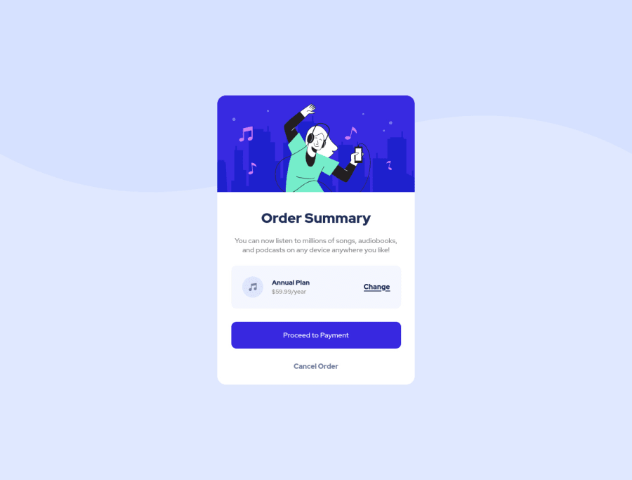
Replace <div class="container"> with the main tag and <h2> with <h1> to fix the accessibility issues. click here for more on web-accessibility and semantic html
To center .container on the page, add min-height:100vh; display: flex; align-items: center: justify-content: center; or min-height:100vh; display: grid place-items: center to the body.
To center .container on the page using flexbox:
body{
min-height: 100vh;
display: flex;
align-items: center;
justify-content: center;
}
To center .container on the page using grid:
body{
min-height: 100vh;
display: grid;
place-items: center;
}
the proceed-btn must have a box-shadow.
Since you used max-width your content is is responsive in the media query you only have to change the background-image.
Use relative units like rem or em as unit for the padding, margin, width values and preferably rem for the font-size values, instead of using px which is an absolute unit. For more on CSS units Click here
Hope am helpful.
Well done for completing this challenge. HAPPY CODING
Marked as helpful
@garcialexco
Posted
@Hassiai Thank you very much for your help! I was struggling with centering items on the page, Flexbox and Grid layouts have been a little confusing to me. Thank you again, super helpful!

