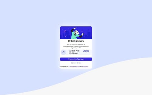
Order summary component responsive landing using media quary

Solution retrospective
I will make sure I calm down during coding exercise because my impatient cost me more headache and time was consumed.
What challenges did you encounter, and how did you overcome them?The box radius for the body was not implementing until I made more researches on YouTube and asked my friends before I realized where the mistake was
What specific areas of your project would you like help with?My button is touching both right and left end of my page which is not suppose too. Even after applying margin, it still didn't change.
Please log in to post a comment
Log in with GitHubCommunity feedback
- @muskan-fatim
Hi Aonullahi! 👋
First of all, great job on completing the challenge and sharing your solution publicly! It's clear you're putting effort into learning and improving your frontend skills, and that's really encouraging to see. 🙌 Here's some detailed feedback based on your work:
✅ What’s Working Well:
- Semantic HTML: You’ve done a nice job using semantic elements like
<main>
, and<section>
where needed. This helps with both accessibility and maintainability. - Responsiveness: The layout holds up well on smaller screen sizes. Using media queries to adjust the component shows good awareness of responsive design.
- Design Accuracy: The component mostly stays true to the original design. Colors, fonts, and structure feel pretty close, which shows attention to detail.
🛠️ Suggestions for Improvement:
1. Accessibility Enhancements:
- Make sure your buttons use proper HTML elements (
<button>
instead of<a>
if not linking somewhere) and that they includearia-labels
or visible text to clarify their function. - Consider adding
alt
text for the image to improve screen reader support. - Ensure that text contrast ratios meet accessibility guidelines (use a tool like WebAIM Contrast Checker).
2. Semantic HTML:
- Consider wrapping the entire component in a
<main>
tag if it's the primary focus of the page. - Use headings (
<h1>
,<h2>
, etc.) appropriately to guide the page structure for screen readers and improve document hierarchy.
3. Layout & Responsiveness:
- On very large screens, the component looks centered, but you could explore adding a max-width and centering it vertically as well for an extra polished feel.
- Adding a small padding/margin around the main container would improve spacing, especially on mobile.
4. Code Quality:
- The CSS could be improved by grouping related styles and commenting sections for clarity.
- Try using CSS custom properties (
--primary-color
,--font-size-base
, etc.) for easier theming and reuse. - Avoid hardcoding widths (like
width: 300px
) unless necessary—use relative units (em
,rem
,%
) for better responsiveness.
Keep it up, Aonullahi! You're on the right track, and each project like this strengthens your skills. Keep challenging yourself, and don't hesitate to revisit old projects with fresh eyes—they're a great way to see how much you've grown. Looking forward to your next build! 🚀
- Semantic HTML: You’ve done a nice job using semantic elements like
- @valryanb
Hi Aonullahi,
Your button is touching both sides because you have its width set to 100%, which takes up 100% of the parent container. (The parent container being your Wrapper div.)
You should try adding padding to your Wrapper div so you have space around your button (btn) element.
Let me know if this helped you!
Cheers, V
Join our Discord community
Join thousands of Frontend Mentor community members taking the challenges, sharing resources, helping each other, and chatting about all things front-end!
Join our Discord