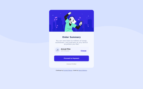
Submitted almost 4 years agoA solution to the Order summary component challenge
Order Summary Component Solution [Using Plain HTML/CSS]

@omerome83
Solution retrospective
So I didn't realize until I was done that it was probably recommended to do this challenge using something like CSS Grid/Flexbox. Oops
Well, I guess it would have made my life easier as this was my biggest struggle in the challenge as I spent a good couple of hours trying to lineup the elements in the middle!
Code
Please log in to post a comment
Log in with GitHubCommunity feedback
- @grace-snow
Hello
You’ve done pretty well here, but the contents is too wide for my mobile. Here are some tips
- if an image is decorative, it doesn’t need an alt value. You can leave it blank like alt=“”
- you don’t need to wrap links in paragraphs. If you are going to do that, make it consistent and do it every time.
- optional, but I expect “change” would perform an action, so should be a button element not anchor tag
- your media query is doing nothing, so you can remove it.
- Biggest tip for you is to get out of the habit of giving elements explicit widths and heights, especially height. Let things be the size they need to be, as dictated by the content and it’s paddings/margins. Use max width and min height only where needed. This will build more responsive solutions - ie if clients change the amount of text, if users view on an unexpected screen size or change their font size etc
I hope this helps
Marked as helpful

Join our Discord community
Join thousands of Frontend Mentor community members taking the challenges, sharing resources, helping each other, and chatting about all things front-end!
Join our Discord