Not Found
Not Found
Not Found
Not Found
Not Found
Not Found
Not Found
Not Found
Not Found
Not Found
Not Found
Not Found
Not Found
Not Found
Not Found
Not Found
Not Found
Not Found
Not Found
Not Found

Submitted

Order Summary component using CSS

#accessibility#foundation

@sukyungdev

Desktop design screenshot for the Order summary component coding challenge

This is a solution for...

  • HTML
  • CSS
1newbie
View challenge

Design comparison


SolutionDesign

Solution retrospective


Hi everyone! I have some questions.

Question 01.

It was difficult for me to make a background for this challenge. Is there no problem with the background I made?

Question 02.

Is it okay to have another section tag inside the section tag?

Your comment are very helpful to me. I will be waiting your comment.

Any other feedback is welcome. Thank you!

Community feedback

P
Fluffy Kas 7,735

@FluffyKas

Posted

Hey there,

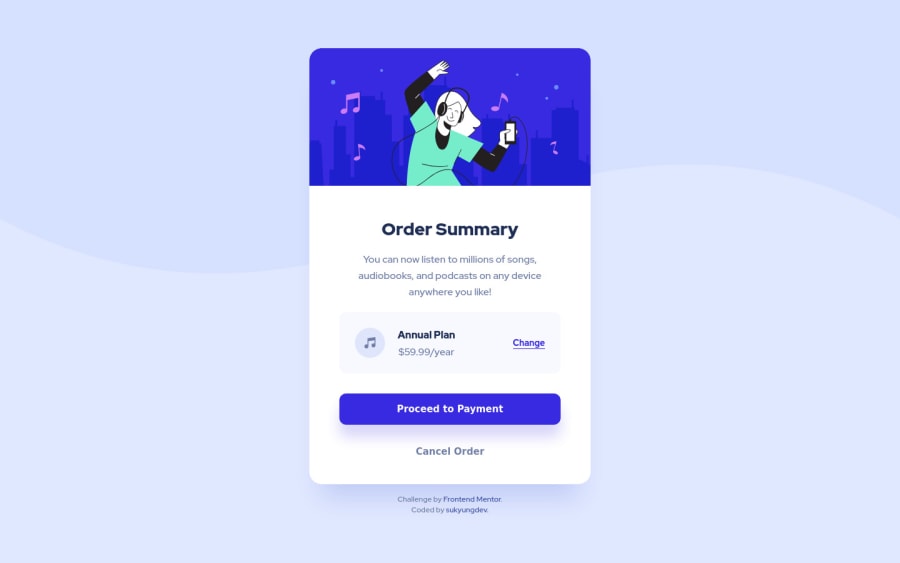
It looks good, well done!

  1. Your background looks fine! You can add both the image and the colour as a background like this: background: url(images/pattern-background-mobile.svg), #E0E8FF. But the way you did it works just as well. ^^

  2. I'd say it's okay to have a section inside a section, although I see no reason to do this, unless it helps you reading your own code easier. By default, section isn't more semantic than a simple div. I usually use sections to separate bigger chunks of content belonging together because it makes it easier for me to find things in my own code ^^ But yeah, if you're interested in knowing more, I suggest reading this article.

There are some other small issues here and there with your solution that you may wanna take a look at:

  1. You should swap your height to min-height: 100vh on the body. You don't want to lock it strictly at 100vh, that could cause problems.

  2. Apart from setting a min-height on your body (which is there for your flexbox to vertically align your component) it's usually the best to avoid setting heights on your elements. If you feel like you need to add some height, try adding some padding or margin instead! That together with the default height of elements is all you need in 99% of cases.

  3. Try not to set your font-size in pixels, you could use rem instead so it would scale if a user was to change their browser's font-size settings.

  4. Don't use strong tag for styling purposes, it has a semantic meaning. Add font-weight to the element if you want to make it bolder.

  5. You need to set a font-family for your buttons, otherwise the browser's default styles apply

  6. No reason to set type="button" on buttons.

  7. Margins, paddings are also best to be set in relative units, like em, rem, etc.

I hope this helped ^^ Good luck!

Marked as helpful

2

@sukyungdev

Posted

@FluffyKas Hi, FluffyKas

Thank you so much for your helpful comment!

I saw your comment and fixed a lot of things (more than I thought!) especially, article about section tag was useful.

Also, I usually used pixel about size, but from now on, em, rem, etc I'll try.

Thank you for your useful opinion. Have a nice day!😊

0
Shawn Lee 560

@OGShawnLee

Posted

Hello!

Your solution looks almost like the design!

  1. You had to use both versions of the background, one for desktop and another one for mobile. You could have done it using a picture tag and source tags inside of it. Add to each source tag the src of the image and a media attribute that informs the browser of when that image should be rendered based on the size of the page.
  2. Yep! Sections are allowed to be nested inside of other sections. However you have to keep in mind is that they must have a heading (h2-h6) inside of it in order to inform screenreaders what that section is all about.

Other than that your solution is all clear! Hope this is useful.

Marked as helpful

1

P
Fluffy Kas 7,735

@FluffyKas

Posted

@OGShawnLee I believe it's actually better how he did it. It's best not to include decorative images in your html if you can avoid it (even though using a picture tag might seem convenient to use here, at first glance).

0
Shawn Lee 560

@OGShawnLee

Posted

@FluffyKas I can't believe it! I thought it was the right way to do it all this time! I like including images in HTML because I use Windi / Tailwind and I don't like to touch css nor check css files at all jeez. Guess I will have to do some critical hotfixes real quick now.

Anyways thank a million for showing me the way!

0
P
Fluffy Kas 7,735

@FluffyKas

Posted

@OGShawnLee Hahaha, I guess we all have a love-hate relationship with css. >.< But yeah, in general, it's a good idea to think whether your images are decorative or not. If they are, background property + media queries are the way to go. If they aren't and they add some extra meaning to the content, then picture can be a great solution. I've been so looking forward to projects where it would be appropriate to use it cos it's so convenient. But so far I think I could only justify it in the Space Tourism challenge. Very sad >.<

Edit: I might be giving the wrong/lazy advice here but if you don't wanna rewrite all your projects, I suppose you could just set a blank alt text and slap an aria-hidden="true" on those images (even tho the above suggested solution is the correct way to do things XD).

1
Shawn Lee 560

@OGShawnLee

Posted

@FluffyKas I used to use SASS and like it. However I find the Tailwind way better for developing quickly and seeing what the UI will look like right from the HTML without having to look at several files at the same time... but it kinda gets bloated when there are too much classes... guess nothing is perfect :'(

Don't worry, most of my projects need some refactors and features here and there anyways. Like my tip calculator solution; it has a substancial amount of a11y and markup issues xD

1

@sukyungdev

Posted

@OGShawnLee Hello, OGShawnLee.

I didn't know how to make it using a picture tag. I learned a new way! And I added subject tag within section tag. Thank you for letting me know.

Thank you for your useful comment! Have a nice day.☺️

1
Shawn Lee 560

@OGShawnLee

Posted

@sukyungdev Always happy to help. Have a nice day too :)

1
Youssif 280

@Youssif94

Posted

Background looks perfect, I did it the same way, they only provide you with one "half" in the style guide, and the second half is identical copy just flipped with a lighter color.

1

@sukyungdev

Posted

@Youssif94 Hi, Youssif94.

I saw your challenge. It was a good reference for me!

Also I fixed my challenge! Thank you for your comment. Have a nice day.😉

0

Please log in to post a comment

Log in with GitHub
Discord logo

Join our Discord community

Join thousands of Frontend Mentor community members taking the challenges, sharing resources, helping each other, and chatting about all things front-end!

Join our Discord