Skip to content
  • Unlock Pro
  • Log in with GitHub
Solution
Submitted over 2 years ago

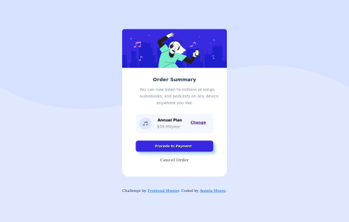
Order Summary Component Using Flexbox

Angela Moore•170
@Cyber-Chic
A solution to the Order summary component challenge
View live sitePreview (opens in new tab)View codeCode (opens in new tab)

Solution retrospective


This is my second challenge on Frontendmentor.io!

I was able to complete the desktop design, but was not sure how to use @media to switch the background wave image on mobile. Any suggestions or additional feedback regarding how to improve my site would be greatly appreciated.

Thank you!

-Angie

Code
Select a file

Please log in to post a comment

Log in with GitHub

Community feedback

  • Hassia Issah•50,390
    @Hassiai
    Posted over 2 years ago

    To center .whiteblock on the page using flexbox, replace the height in the body with min-height: 100vh.

    You forgit to give the button a box-shadow.

    For a responsive content, replace the width in .whiteblock with max-width and increase it value for it be equivalent to the design. max-width:432px

    Use relative units like rem or em as unit for the padding, margin, width values and preferably rem for the font-size values, instead of using px which is an absolute unit. For more on CSS units Click here

    This challenge requires a media query, in the media query you have to change the background-image of the body.

    Hope am helpful.

    Well done for completing this challenge. HAPPY CODING

    Marked as helpful
  • P
    visualdennis•8,375
    @visualdenniss
    Posted over 2 years ago

    Hey there Angela,

    nice work! Regarding media, u can do it simply with

    • @media only screen and (max-width: 375px) { body { background: url() } }

    • You can add a background color change on button hover and color change when hovering on links (e.g. button::hover , a::hover) to indicate interactivity of the elements to the user and improve user experience.

    • Try to avoid giving fixed heights or max-heights for text containing elements like you have for .card, even if it is in rem, because it can cause issues later on (with changing dynamic data, when the user changes font-sizes, or even browser rendering issues etc.)

    • Screenshots are taken on a Firefox browser and 1440px, it might be that your default settings are different, (zoom, scale, resolution etc.) so there is some difference, but i wouldn't worry about it much, as long as your solution looks good enough, its good. After all, these challenges are not about being pixel-perfect.

    Hope you find this feedback helpful!

    Marked as helpful
  • Angela Moore•170
    @Cyber-Chic
    Posted over 2 years ago

    I also noticed that my uploaded designs looks much bigger when I'm editing them, but then look significantly smaller once I post my solution. Any tips for making sure that I size these correctly?

    Thanks!

    -Angie

Join our Discord community

Join thousands of Frontend Mentor community members taking the challenges, sharing resources, helping each other, and chatting about all things front-end!

Join our Discord

Stay up to datewith new challenges, featured solutions, selected articles, and our latest news

Frontend Mentor

  • Unlock Pro
  • Contact us
  • FAQs
  • Become a partner

Explore

  • Learning paths
  • Challenges
  • Solutions
  • Articles

Community

  • Discord
  • Guidelines

For companies

  • Hire developers
  • Train developers
© Frontend Mentor 2019 - 2025
  • Terms
  • Cookie Policy
  • Privacy Policy
  • License

Oops! 😬

You need to be logged in before you can do that.

Log in with GitHub

Oops! 😬

You need to be logged in before you can do that.

Log in with GitHub

How does the accessibility report work?

When a solution is submitted, we use axe-core to run an automated audit of your code.

This picks out common accessibility issues like not using semantic HTML and not having proper heading hierarchies, among others.

This automated audit is fairly surface level, so we encourage to you review the project and code in more detail with accessibility best practices in mind.

How does the CSS report work?

When a solution is submitted, we use stylelint to run an automated check on the CSS code.

We've added some of our own linting rules based on recommended best practices. These rules are prefixed with frontend-mentor/ which you'll see at the top of each issue in the report.

The report will audit all CSS, SCSS and Less files in your repository.

How does the HTML validation report work?

When a solution is submitted, we use html-validate to run an automated check on the HTML code.

The report picks out common HTML issues such as not using headings within section elements and incorrect nesting of elements, among others.

Note that the report can pick up “invalid” attributes, which some frameworks automatically add to the HTML. These attributes are crucial for how the frameworks function, although they’re technically not valid HTML. As such, some projects can show up with many HTML validation errors, which are benign and are a necessary part of the framework.

How does the JavaScript validation report work?

When a solution is submitted, we use eslint to run an automated check on the JavaScript code.

The report picks out common JavaScript issues such as not using semicolons and using var instead of let or const, among others.

The report will audit all JS and JSX files in your repository. We currently do not support Typescript or other frontend frameworks.

Oops! 😬

You need to be logged in before you can do that.

Log in with GitHub

Oops! 😬

You need to be logged in before you can do that.

Log in with GitHub

Oops! 😬

You need to be logged in before you can do that.

Log in with GitHub