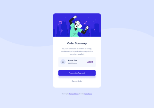
Not Found
Not Found
Not Found
Not Found
Not Found
Not Found
Not Found
Not Found
Not Found
Not Found
Not Found
Not Found
Not Found
Not Found
Not Found
Not Found
Not Found
Not Found
Not Found
Not Found

Submitted

Order Summary Component with HTML CSS and Flex

@DamnItAzriel

Desktop design screenshot for the Order summary component coding challenge

This is a solution for...

  • HTML
  • CSS
1newbie
View challenge

Design comparison


SolutionDesign

Solution retrospective


Hello guys, let me know what you think about this webpage.

Community feedback

P
Fluffy Kas 7,735

@FluffyKas

Posted

Heya, great job on this one! Looks pretty close to the original design, just a few small improvements needed:

  1. Setting a background-size: contain on the body would make the background image look a bit nicer instead of being cut off ^^

  2. Alt text for the hero image: " Background Illustration" isn't the best choice. If you think this image is only decorative, you can leave its alt text empty. If not, then you should help people who can't see the image (people using screen readers or have images turned off in the browser) to have an idea what the picture is about. Something like "Girl listening to music." or whatever you feel appropriate.

  3. I'd say using classes instead of IDs would be a good idea. Although this is a small project only, in real life your aim is to create reusable elements and styles and IDs are not suitable for that.

  4. Avoid inline styling at all costs, you have a stylesheet linked to your html for styling purposes.

  5. Headings: headings have a semantic meaning and should not be used for styling (their looks you can change with css anyway), so you should always start from <h1> going down by one every time you need a heading.

  6. Your main div could be swapped for main, your attribution div to footer to make things more semantic.

It was a great idea to add a custom README to your project though, it's very nice to see your thought process! On that note, I don't think you should change the payment button to a link. :) Button is the most appropriate element here. If you want the cursor to show, you can add cursor: pointer to pretty much any element, even to a div (this doesn't make the div clickable). Not sure why you'd do that though :D

Marked as helpful

1

@DamnItAzriel

Posted

@FluffyKas Thank you very much! You read the whole README for this project for sure. I will update the webpage with the points suggested here. I get the idea of why button over div clearly now as you have explained. While approaching the payment button, I first approached it without button and couldn't proceed ahead. Just wanted to see if it would be feasible or not.

Again thanks for the detailed feedback. It's appreciated.

0

Please log in to post a comment

Log in with GitHub
Discord logo

Join our Discord community

Join thousands of Frontend Mentor community members taking the challenges, sharing resources, helping each other, and chatting about all things front-end!

Join our Discord