Submitted about 1 year agoA solution to the Order summary component challenge
Order Summary Component

@AV-DN
Solution retrospective
What are you most proud of, and what would you do differently next time?
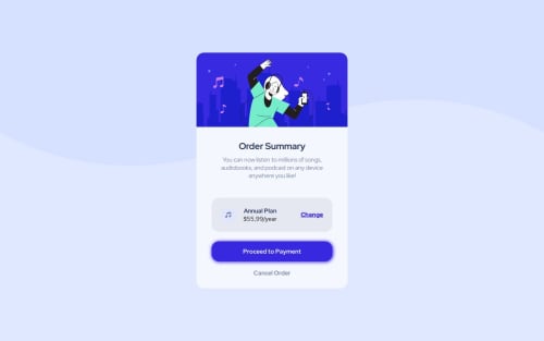
This one was pretty quick, but I might use another method to separate the "change" tag because I used margin-left: auto; and I'm not sure if it was the best choice. And I think I didn't have to use a media query for this one, despite the responsiveness issues for screen sizes smaller than 300px.
What challenges did you encounter, and how did you overcome them?I learned to use backgrounds better in this challenge.
What specific areas of your project would you like help with?I want to know how I could separate the "change" part from the other elements besides using space-between.
Code
Loading...
Please log in to post a comment
Log in with GitHubCommunity feedback
No feedback yet. Be the first to give feedback on DV-AN's solution.
Join our Discord community
Join thousands of Frontend Mentor community members taking the challenges, sharing resources, helping each other, and chatting about all things front-end!
Join our Discord