Skip to content
  • Unlock Pro
  • Log in with GitHub
Solution
Submitted over 3 years ago

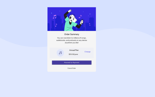
Order Summary Componet webpage
backbone, foundation, materialize-css, accessibility
Abhishek Waghmare•30
@abhishekdwaghmare2000
A solution to the Order summary component challenge
View live sitePreview (opens in new tab)View codeCode (opens in new tab)

Solution retrospective


Hello Community, I would like if you give me suggestion regarding code improvement, mistakes I did in code, improvement, etc. I am also facing difficulty in responsive designing in this tasks, if you suggest the improvements and other things that I should work on. It would be really helpful, if you suggest improvements or mistakes.

Code
Select a file

Please log in to post a comment

Log in with GitHub

Community feedback

  • Remus D. Buhaianu•3,125
    @remusbuhaianu
    Posted over 3 years ago

    Hey Abhishek, I had a look through your code and final solution and I'd say you still have quite a few things to complete:

    • First of all, there isn't any responsive design implemented in your project. Consider using media queries to solve this issue

    • Make the corners of your card and button more round with the border-radius property

    • Your "Change" text should be inside an <a> element and same goes for "Cancel Order"

    • Your button should have a hover effect. Also, remove the default border by using "border: none". Change the background color and the font you use for the text inside the button and add a box shadow similar to the one in the original design.

    • The music icon is vertically stretched.

    • The elements inside the .content div aren't properly aligned. The margin properties you used there are causing a lot of the issues.

    • Your card isn't properly aligned vertically and horizontally. You used margin, margin-left, margin-top, and margin-right to position your element. Not only that, but you used % for it. Your element is positioned absolute so it'd make more sense to use the top, bottom, left, and right properties. But for a simpler solution, you could use display flex or you could also use the display grid property along with "place-content: center"

    https://developer.mozilla.org/en-US/docs/Web/CSS/CSS_Flexible_Box_Layout/Aligning_Items_in_a_Flex_Container

    https://developer.mozilla.org/en-US/docs/Web/CSS/place-content

    Hope this helps. Keep it up and practice as much as you can. ;)

  • Grace•32,130
    @grace-snow
    Posted over 3 years ago

    Hi. All good feedback already I'll just add a bit more (and make sure you spend time refactoring this challenge before moving on, it will be really important)

    • definitely don't position absolute this card or use large margins. Try flexbox properties and a min-height 100vh on the main
    • you haven't closed your main element - it's important to Indent your code consistently ever time then it will be easy for you to spot errors like that. The browser is forgiving and will auto close tags for you, but often these are in the wrong place or introduce all sorts of annoying bugs that are hard to find
    • Read about how and when to write image alt text and what it's for. These all need changing
    • never style on IDS. That's not what they're for. Lots of tutorials out there may teach bad practices using IDS as css or javascript selectors but you should avoid it.

    I hope this adds a bit more help on top of the great tips you've had already

  • Abhishek Waghmare•30
    @abhishekdwaghmare2000
    Posted over 3 years ago

    @Remus432 Thank you for explaining each point where I am doing wrong and providing useful resources. This is going to be really helpful to work on these things and fix this issue. Thanks Again!

  • darryncodes•6,350
    @darryncodes
    Posted over 3 years ago

    Hi Abhishek,

    Nice solution, solid job all round.

    • you should add overflow: hidden; to .card so the image doesn't overflow and cover up the rounded edges of your card

    Keep coding!

  • Sam Guliker•540
    @Sam-Guliker
    Posted over 3 years ago

    Hi, Abhisek

    Double check the paddings and fonts? They seem a bit off. Next to that try to use landmarks like so: <main> {your content}</main> https://developer.mozilla.org/en-US/docs/Web/Accessibility/ARIA/Roles/main_role

    A heading is also nice to have :) https://developer.mozilla.org/en-US/docs/Web/HTML/Element/Heading_Elements

    Happy coding

  • nikbos•30
    @nikbos
    Posted over 3 years ago

    Rounded corners and the color of Proceed to Payment button.

Join our Discord community

Join thousands of Frontend Mentor community members taking the challenges, sharing resources, helping each other, and chatting about all things front-end!

Join our Discord
Frontend Mentor logo

Stay up to datewith new challenges, featured solutions, selected articles, and our latest news

Frontend Mentor

  • Unlock Pro
  • Contact us
  • FAQs
  • Become a partner

Explore

  • Learning paths
  • Challenges
  • Solutions
  • Articles

Community

  • Discord
  • Guidelines

For companies

  • Hire developers
  • Train developers
© Frontend Mentor 2019 - 2025
  • Terms
  • Cookie Policy
  • Privacy Policy
  • License

Oops! 😬

You need to be logged in before you can do that.

Log in with GitHub

Oops! 😬

You need to be logged in before you can do that.

Log in with GitHub

How does the accessibility report work?

When a solution is submitted, we use axe-core to run an automated audit of your code.

This picks out common accessibility issues like not using semantic HTML and not having proper heading hierarchies, among others.

This automated audit is fairly surface level, so we encourage to you review the project and code in more detail with accessibility best practices in mind.

How does the CSS report work?

When a solution is submitted, we use stylelint to run an automated check on the CSS code.

We've added some of our own linting rules based on recommended best practices. These rules are prefixed with frontend-mentor/ which you'll see at the top of each issue in the report.

The report will audit all CSS, SCSS and Less files in your repository.

How does the HTML validation report work?

When a solution is submitted, we use html-validate to run an automated check on the HTML code.

The report picks out common HTML issues such as not using headings within section elements and incorrect nesting of elements, among others.

Note that the report can pick up “invalid” attributes, which some frameworks automatically add to the HTML. These attributes are crucial for how the frameworks function, although they’re technically not valid HTML. As such, some projects can show up with many HTML validation errors, which are benign and are a necessary part of the framework.

How does the JavaScript validation report work?

When a solution is submitted, we use eslint to run an automated check on the JavaScript code.

The report picks out common JavaScript issues such as not using semicolons and using var instead of let or const, among others.

The report will audit all JS and JSX files in your repository. We currently do not support Typescript or other frontend frameworks.

Oops! 😬

You need to be logged in before you can do that.

Log in with GitHub

Frontend Mentor for Teams

Frontend Mentor for Teams helps companies and schools onboard and train developers through project-based learning. Our industry-standard projects give developers hands-on experience tackling real coding problems, helping them master their craft.

If you work in a company or are a student in a coding school, feel free to share Frontend Mentor for Teams with your manager or instructor, as they may use it to help with your coding education.

Learn more

Oops! 😬

You need to be logged in before you can do that.

Log in with GitHub

Oops! 😬

You need to be logged in before you can do that.

Log in with GitHub

Oops! 😬

You need to be logged in before you can do that.

Log in with GitHub

Oops! 😬

You need to be logged in before you can do that.

Log in with GitHub

Oops! 😬

You need to be logged in before you can do that.

Log in with GitHub