Not Found
Not Found
Not Found
Not Found
Not Found
Not Found
Not Found
Not Found
Not Found
Not Found
Not Found
Not Found
Not Found
Not Found
Not Found
Not Found
Not Found
Not Found
Not Found
Not Found

Submitted

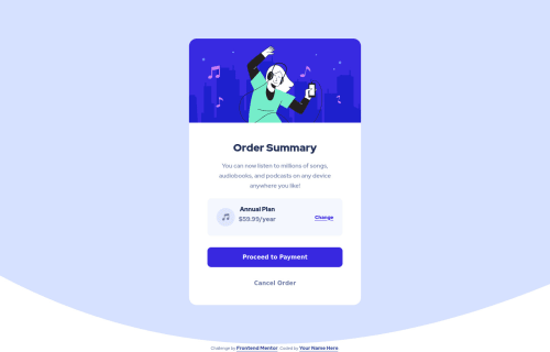
Order summary mobile first with html and css

Bernard• 195

@Bernardanxiety

Desktop design screenshot for the Order summary component coding challenge

This is a solution for...

  • HTML
  • CSS
1newbie
View challenge

Design comparison


SolutionDesign

Solution retrospective


In all honesty, I am kinda disappointed that this challenge was like 5 times harder for me that it actually looks like, i feel like i should've done it way faster and way better. Im looking for literally any kind of advice at both html and css so i can get better and keep going at my front-end adventure. Thanks in advance.

Community feedback

Rachael• 610

@RMK-creative

Posted

Hi Bernard, nice work! Your solution looks really similar to the design

Along with the comment already posted, I would just add to check out the responsiveness - it looks good on desktop and mobile, but tablet needs a bit of adjusting.

What were the things that you found most challenging? I also struggle with expectation vs. reality with a lot of challenges, but I try not to focus too much on that aspect. Identifying the harder bits so I can learn from them has become much more important.

Don't be too hard on yourself, you're doing a really awesome job!

Marked as helpful

2

Bernard• 195

@Bernardanxiety

Posted

@RMK-creative Yeah i know, in my previous challenges i did queries for middle sizes but this one i just wanted to tackle the challenge itself. I feel like the challenge at first looks very easy therefore im hard on myself on this one. I'd love to land a front-end job one day and it kinda hurts me such easy looking thing seems so hard.

I think the little box with a music icon, annual plan and link was the hardest. I always think whether i could do the html better or not, i also wonder why i couldn't center annual plan vertically. I took margins off it and just created space within the box with padding + used align-items or content, whichever it is to center it but it still was a bit to the top for some reason.

0
Rachael• 610

@RMK-creative

Posted

@Bernardanxiety I totally get what you mean! I've had to work a lot (and still do) on enjoying the process of learning as I build, rather than focus on getting the project done quickly. I guess it's all part of this journey that we've chosen 😉

Regarding the section you're trying to center, I just used dev tools to find that there is a margin-bottom set on <p> elements, which is applying it to your .accent class. Adding margin-bottom: 0 to the class will fix that for you. With the html for that section, maybe a <ul> with two <li> would work better in this case, and it will also help you align both lines perfectly to the left.

Marked as helpful

1
Bernard• 195

@Bernardanxiety

Posted

@RMK-creative Oh shoot, thanks, idk how come i didn't use dev tools to check where the space is coming from, i guess i took way too long breaks during studying front-end. I guess procrastination hits too hard when you just hit walls that aren't that easy to overcome or don't know what to do next.

0
lisoviy• 60

@lisov1y

Posted

Hey pal, you did a great job! It looks perfect to me, I just see there two things that you can fix easily:

  1. Annual plan (your accent class) is not centered in your plan box.
  2. You don't have the shadow below the payment button.

Everything else looks great, we all struggle with this in the beginning, believe me! But don't give up and practice more, that's the only advice and you will be the best!

1

Bernard• 195

@Bernardanxiety

Posted

@lisov1y 1. Centered vertically or horizontally? Because it's a little bit to the left in the design, vertically though, i somehow couldn't center it through flex align thing.

0
lisoviy• 60

@lisov1y

Posted

@Bernardanxiety, my bad, centered vertically. It seems it's closer to the top. I figured it out using flexbox. If you want to get better with flexboxes I strongly suggest you a game called "Flexbox zombies"(Idk if I can paste links here but you find it easily).

0
Bernard• 195

@Bernardanxiety

Posted

@lisov1y Oh, i think i've even opened it somewhere along my 500 google chrome tabs for later haha. But still, i tried to center everything vertically through align-items center and it's still to the top. Maybe because i took margins off it and created space within that div with padding? Idk but it's the only thing that's to the top like that even though they are all centered vertically.

0

Please log in to post a comment

Log in with GitHub
Discord logo

Join our Discord community

Join thousands of Frontend Mentor community members taking the challenges, sharing resources, helping each other, and chatting about all things front-end!

Join our Discord