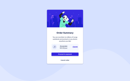
Order summary page with html and CSS

Solution retrospective
feedback is welcome is there a better way I could have done this? especially for gapping the items in the flexbox
Please log in to post a comment
Log in with GitHubCommunity feedback
- @vanzasetia
Greetings, Stephanie! 👋
Great work on this challenge! Your solution looks pretty good! 😀
Here are some areas that you can improve.
- Not all images need alternative text. In this case, all the images are decorative images which mean that even if the images doesn't exist, the users still be able to understand and interact with the site. So, you could leave the
alt=""
empty and to prevent VoiceOver screen reader pronounce the emptyalt
images, addaria-hidden="true"
. - Always specify the
type
of thebutton
. In this case, set the type of them astype="button"
. It's going to prevent the button from behaving unexpectedly (like submitting). - I would recommend adding some
padding
on thebody
element to prevent the card from having a full width on mobile view, my mobile screen size is 360px * 640px.
I hope this helps! Keep up the good work! 👍
Marked as helpful - Not all images need alternative text. In this case, all the images are decorative images which mean that even if the images doesn't exist, the users still be able to understand and interact with the site. So, you could leave the
- @2div
Hello Stephanie First of all congratulation on completing this challenge and your solution is very good. below are my tips for improvement :
- Fix the a accessibility issue by change h2 to h1
- Also you need to increase the border radius for the box and the button
- You need to check the size for mobile screen because card look large.
over all you did great.
Marked as helpful
Join our Discord community
Join thousands of Frontend Mentor community members taking the challenges, sharing resources, helping each other, and chatting about all things front-end!
Join our Discord