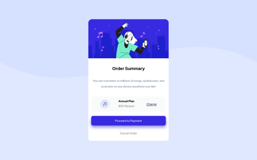
order-summary-component

Solution retrospective
Attempted this one to get quicker at turning around these card projects. One thing that i couldn't get to work was the background image (two shades of lilac wave-design): I tried css: background-image: url() property; background-repeat: no-repeat; tried background-size: cover and/or contain; background-position: center;
I couldn't get the wave feature to be positioned as per the desktop design. For me, the background properties I used above rendered the wave further up the screen. In the end i added the image using html img tag. It would be interesting to know how this was done with more 'elegantly'. Thanks
Please log in to post a comment
Log in with GitHubCommunity feedback
No feedback yet. Be the first to give feedback on Will's solution.
Join our Discord community
Join thousands of Frontend Mentor community members taking the challenges, sharing resources, helping each other, and chatting about all things front-end!
Join our Discord