


Bálint Korpai• 620
@kemenyfa-szu
Posted
Hello @ahmed-shahat!
Congratulations on nailing this challenge. The mobile size is almost the copy of the design.
Let me write here my observations:
- You can improve the semantic markup. Usually the header, main and footer tags are separate from each other. You should not wrap them into one div. The header element in general holds the logo and the navigation bar and other elements that are always on top of every page of the site. For components like this whole challenge's card can be a whole section because it's content are semantically meant to be together.
- You used max-width: 29% on the .container class. It makes the page fall apart on smaller screen width above 375px. You can improve it if you wrap this 29% in a max function like: max-width: max([x]rem, 29%); But it is better to define a min-width: [x]rem, and define a width: 29%.
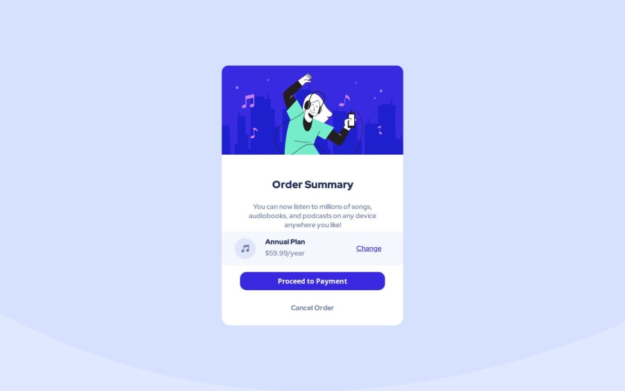
- Above 1500px screen width, the hero section picture get narrower then the whole component. You capped the img element to max-width: 100%, which is good in general, but you can define a .header-img {width: 100%} to eliminate this artifact.
Best wishes!
Marked as helpful
0
