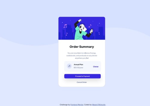
Order-Summary-Component Solution (HTML, CSS, BOOTSTRAP)

Solution retrospective
I found it a bit difficult to add padding to the card-text in the CSS for Mobile screen sizes because the text would not be stacked and the lines did not break or seem as the same in the desktop image for the challenge. Padding did not help breaking the lines appropriately, possible that Bootstrap was messing things up a tiny bit.
I'm unsure of the part where I used media queries, I am not sure if it really helped to make it accessible for those two screen sizes (1440px, 375px).
May someone please tell me on how I can improve my usage of media queries and to use better ways of positioning content i.e flexbox, css grid, etc. May someone please tell me on how I can u
Please log in to post a comment
Log in with GitHubCommunity feedback
No feedback yet. Be the first to give feedback on Wagon706's solution.
Join our Discord community
Join thousands of Frontend Mentor community members taking the challenges, sharing resources, helping each other, and chatting about all things front-end!
Join our Discord